drawing, ink
#
drawing
#
baroque
#
ink
Dimensions: height 226 mm, width 319 mm
Copyright: Rijks Museum: Open Domain
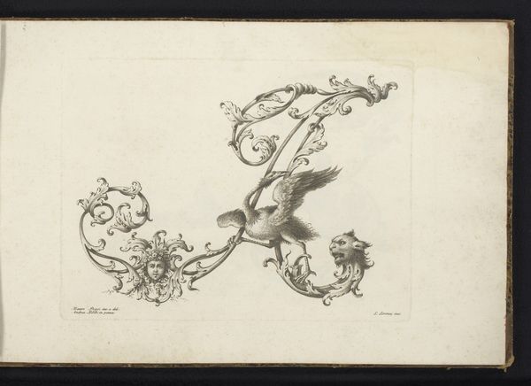
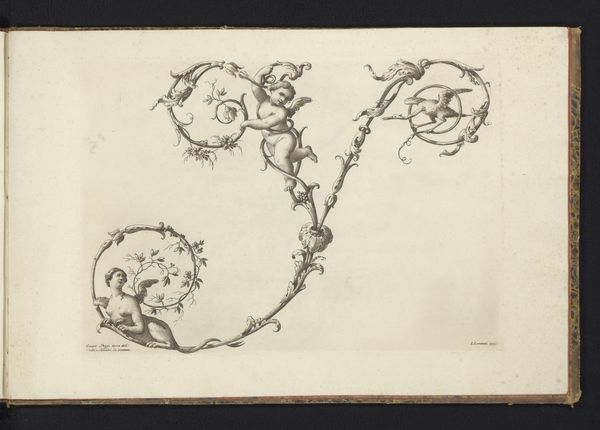
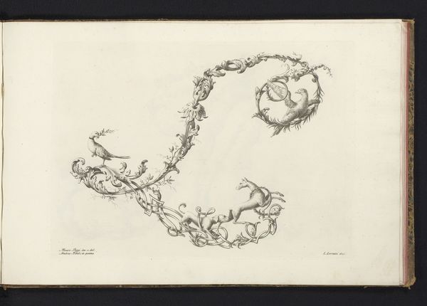
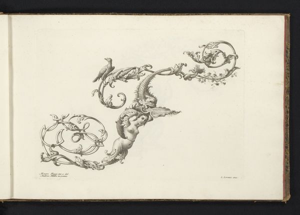
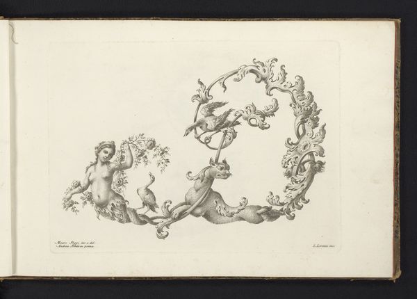
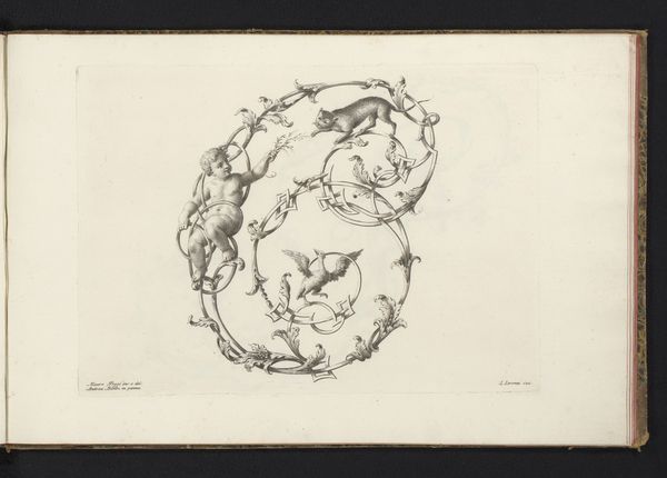
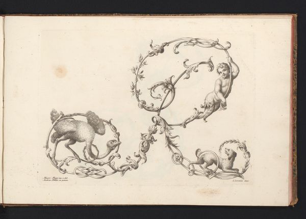
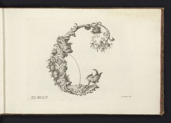
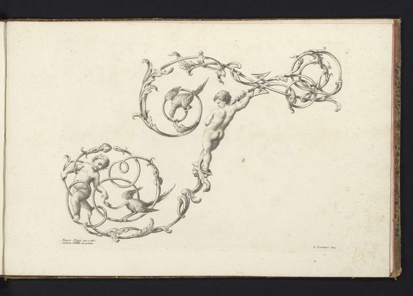
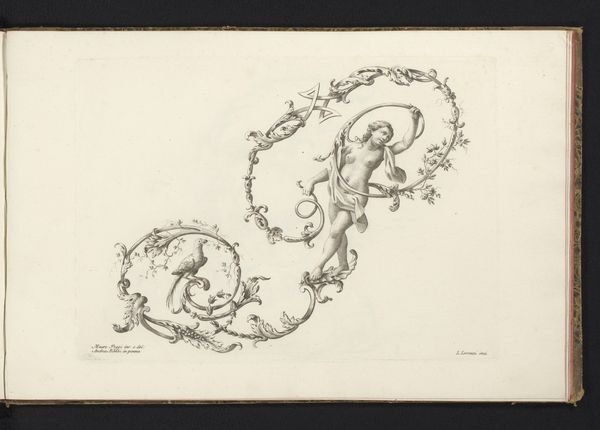
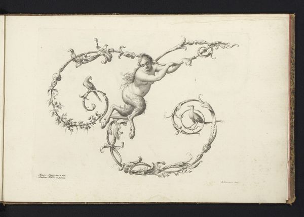
Editor: Okay, next up we have “Ornamentele letter K,” or “Ornamental Letter K,” by Lorenzo Lorenzi, sometime between 1745 and 1765. It’s an ink drawing at the Rijksmuseum. The letter itself is almost overwhelmed by decorations…there's foliage, some kind of griffin-goat creature, and even a little bird perched on the side. What strikes you most about this piece? Curator: Well, doesn't it just sing of the Baroque era? This isn't just a letter; it’s a performance. Look at that "K"—hardly recognizable amidst all the flourishes, almost a celebration of ornamentation over legibility! The inkwork is so delicate, giving it a sense of lightness. It feels almost as if he is designing an alternate reality in the shape of a letter; can you imagine writing that font? Editor: A bit illegible, you’re right! I mean, a griffin-goat? Where does that come from? Curator: Exactly! It comes from a period when design was theatrical, full of drama, invention and surprise. He uses mythical creatures, foliage and curlicues to overwhelm you in the most pleasant way. Now, isn't it amazing how something as simple as a letter can be transformed into such a whimsical piece? It’s almost as if he is hinting at hidden worlds behind something so mundane, or what do you think? Editor: I suppose. It does seem to suggest a hidden world; very ornate. Thanks for shedding light on that! Curator: My pleasure. Art teaches us to see hidden possibilities everywhere. Always let art surprise you, and you won’t be disappointed.
Comments
No comments
Be the first to comment and join the conversation on the ultimate creative platform.
More like this