#
neo-pop
Copyright: Modern Artists: Artvee
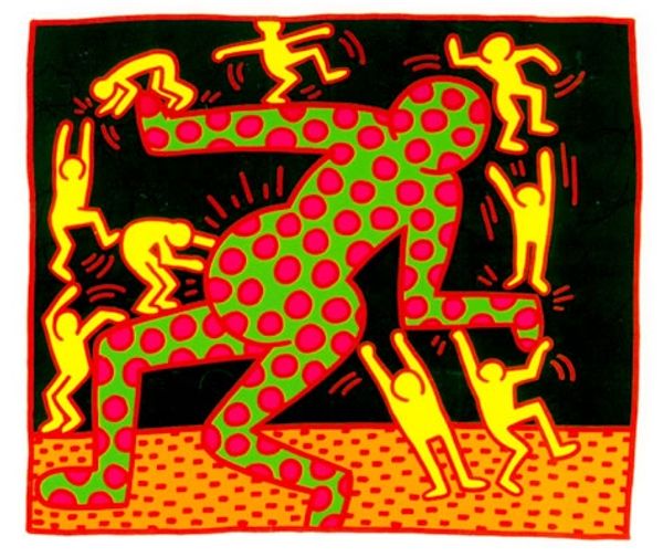
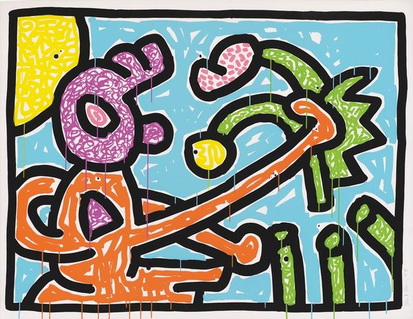
Keith Haring made Fertility Suite at an undetermined date with screenprinting. The first thing that hits you is the graphic punch of it all. Haring's not messing around with subtle shades here; it’s bold, flat color all the way. It’s like he’s saying, “Here’s the idea, bam! Take it or leave it.” Those flying saucers, that pyramid zapped with green energy, the little figure with the pregnant belly—it’s all so direct, yet so weirdly playful. And the screenprinting – it gives everything this slick, almost mechanical feel, which is wild when you think about the subject matter. It's like he's taking something ancient, like fertility, and throwing it into a sci-fi blender. There's something about the dots on the pyramid, like a pattern and then these weird rays pointing up and out that gets me. It reminds me a little of Miró, who used symbols in his work too, but Haring brings this whole street-smart, pop-art sensibility to it that’s all his own.
Comments
No comments
Be the first to comment and join the conversation on the ultimate creative platform.
More like this