Panorama van de Rotterdamse haventerreinen op de Kop van Zuid c. 1878 - 1900
0:00
0:00
print, typography
# print
#
typography
#
decorative-art
Dimensions: height 166 mm, width 237 mm, thickness 16 mm, height 150 mm, width 1440 mm
Copyright: Rijks Museum: Open Domain
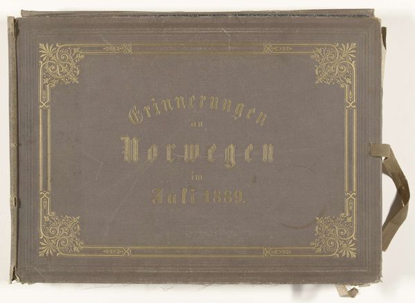
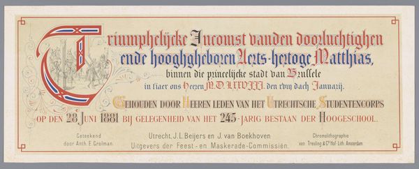
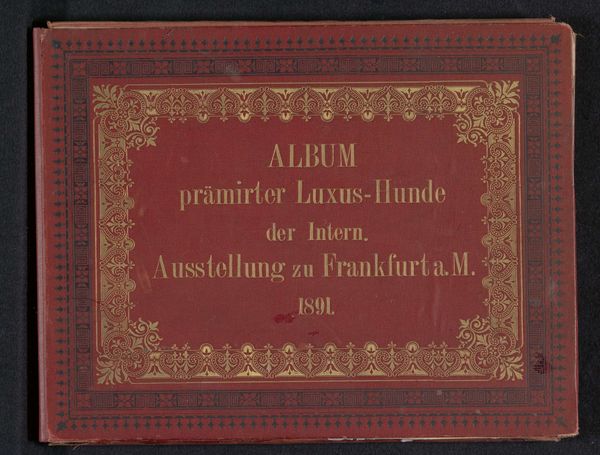
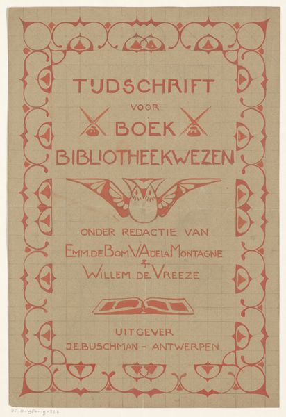
Editor: At first glance, the immediate feel is one of understated elegance. A red print of typography reminiscent of older formal notices. Curator: Quite right. We are looking at a print dating back to the late 19th century, sometime between 1878 and 1900, entitled "Panorama van de Rotterdamse haventerreinen op de Kop van Zuid" – a panoramic view of the Rotterdam harbor area at the Kop van Zuid. It's attributed to F. von Pöppinghausen. Editor: The decorative border around the central text seems almost neoclassical in its simplicity, but there is a striking formal interplay between the embossed framework and the gilded letters. Is this simply about announcing place or is there something else in these aesthetic decisions? Curator: Absolutely. The text functions more than merely descriptively; consider the intentional arrangement of its gilded lettering across the solid red field. “Panorama der Hafenwerken te Rotterdam”, is layered to generate vertical tension, then secured by a horizontal frieze and a subtly textured surface. It creates an overall optical solidity; an enduring commercial monument. Editor: And the very choice of Rotterdam? A vital port city. The imagery immediately connects with themes of trade, commerce, and perhaps a growing national pride associated with Rotterdam’s importance. What was Pöppinghausen's intention with the decorative flourishes—leaf motifs? Is there an effort to refine raw industry? Curator: Pöppinghausen creates this work through that lens; a sense of order amid the industrial boom and topographical ambition. Even its medium itself is a functional demonstration of burgeoning modernity: economical deployment of text, readily multiplied for swift transmission. The typography's semi-circular organization feels like a horizon. Editor: Yes, in conjunction with the landscape itself. Pöppinghausen’s print speaks of a very deliberate visualization of Rotterdam’s economic might and cosmopolitan identity. What stays with me is the ambition embedded in what seems a purely utilitarian design. Curator: For me, it's in considering that ambition made tangible through the work’s materials and form; not merely functional, but evocative in their very composition.
Comments
No comments
Be the first to comment and join the conversation on the ultimate creative platform.
