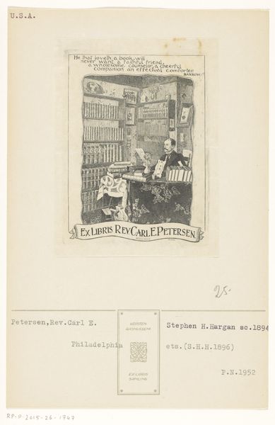
graphic-art, print, typography, poster
#
graphic-art
#
art-nouveau
#
dutch-golden-age
# print
#
book
#
traditional media
#
typography
#
decorative-art
#
poster
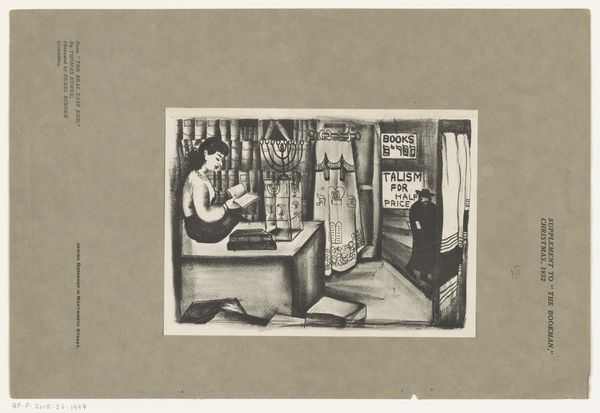
Dimensions: height 295 mm, width 95 mm
Copyright: Rijks Museum: Open Domain
This poster by an anonymous artist advertises Holkema & Warendorf publishers in Amsterdam. It’s not precious, it gets right to the point. I love how the books are treated as objects, all lined up like actors on a stage. There are the spines that are designed like the buildings and interiors of these books. The drawings are simple, almost cartoonish, but that simplicity belies a real understanding of form and composition. Look at the way the artist uses line to create depth. The texture is flat, matte, and smooth. It's like a page in a book, it invites you to touch. The color palette is very muted and understated. A kind of humble design, nothing too slick. This poster reminds me a little of the work of Ben Shahn, who also used simple, direct imagery to convey a message. But really, it's part of a long tradition of commercial art that goes back to the beginning of printmaking. Like art, it embraces ambiguity and multiple interpretations over fixed or definitive meanings.
Comments
No comments
Be the first to comment and join the conversation on the ultimate creative platform.
More like this