Copyright: National Gallery of Art: CC0 1.0
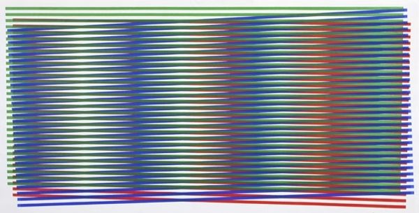
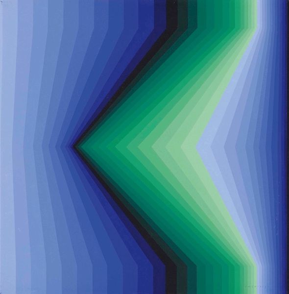
This untitled piece was made with lithography by Garo Antreasian, we don’t have a date. The way Antreasian uses the gradient feels like a study, or maybe even a colour chart. The marks are really controlled, yet somehow, they still feel playful. I love that even though it’s a print, you can still feel the process of how it was made. The lines are like little building blocks of colour, and the red background really makes them pop. The texture is smooth, almost like glass, which gives it a cool, detached vibe. It reminds me a little of some of Josef Albers’ work with colour, but with a more whimsical touch. It’s as if he is thinking through colour in a very deliberate way, a conversation about how we see and perceive.
Comments
No comments
Be the first to comment and join the conversation on the ultimate creative platform.
More like this