Copyright: Rijks Museum: Open Domain
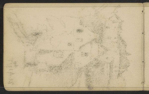
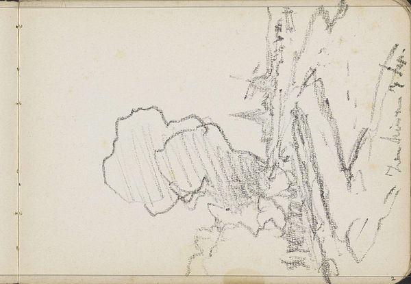
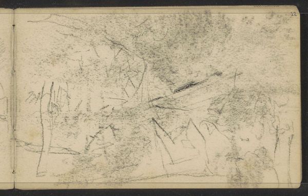
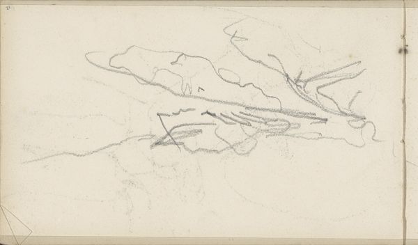
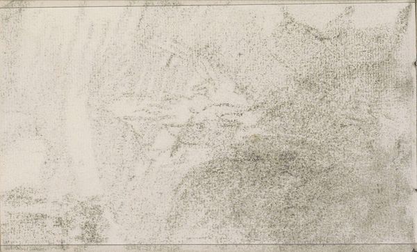
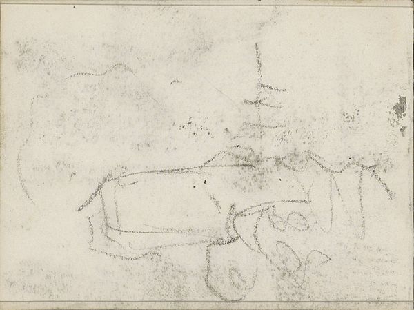
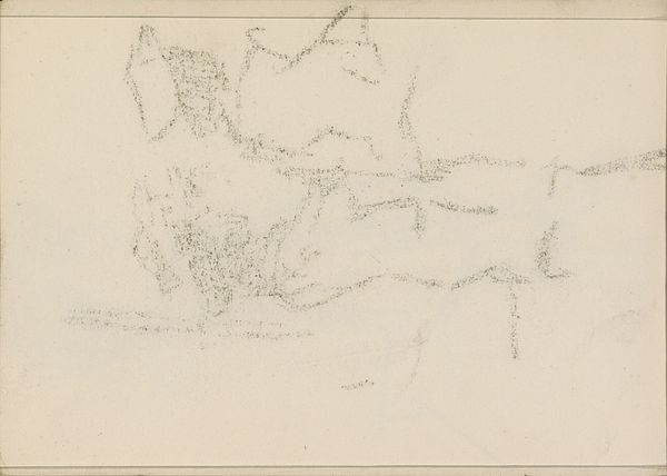
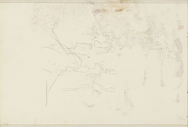
Editor: This is "Studie," a pencil drawing on paper by Anton Mauve, dating from sometime between 1848 and 1888. At first glance, the composition appears quite abstract, almost chaotic with the lines, but also gives the impression of a windswept landscape. What do you see in this piece from a formalist perspective? Curator: Initially, it is crucial to consider the artist's meticulous choices. The medium—pencil on paper—offers an immediate, almost raw connection to the artist's hand. Notice how Mauve varies the pressure, creating depth and texture through line density. The absence of color directs our attention to the interplay of light and shadow, skillfully rendered with graphite. Editor: Yes, the density is really interesting. Almost all the "weight" seems to be concentrated in the lower third of the picture, leaving the upper portion much more sparse. What do you make of that compositional choice? Curator: Precisely. This compositional weighting grounds the piece, despite the ephemeral quality of the lines themselves. Consider the strategic use of empty space, particularly above the heavier strokes. The contrast between void and density compels our gaze upward, as though leading us into the sky itself. How does this imbalance of dark and light play into a semiotic understanding of Romanticism's visual language? Editor: I hadn’t thought about it that way, but the sparseness really does seem to give more depth to the tonal weight at the bottom. So, by isolating form and technique, you can begin to read the symbolism without knowing the artist's specific intent. Curator: Exactly. The inherent visual grammar reveals its meaning. Form precedes content. Thinking this way makes the work much more rewarding for me. I think next I'd like to consider the concept of mimesis as we observe it...
Comments
No comments
Be the first to comment and join the conversation on the ultimate creative platform.
More like this