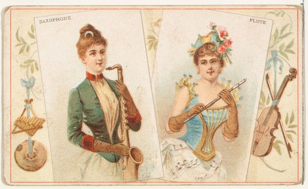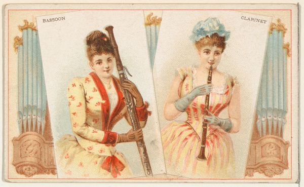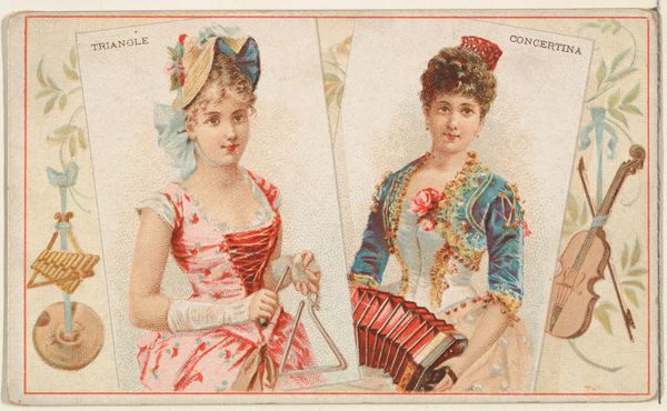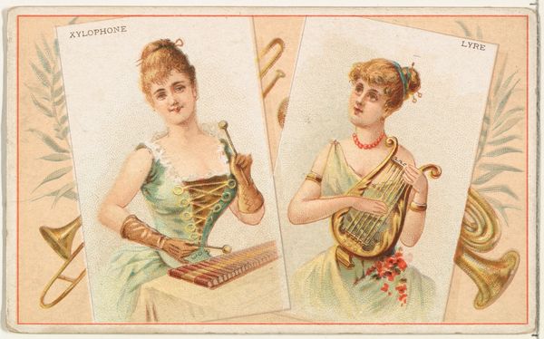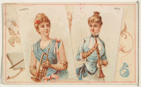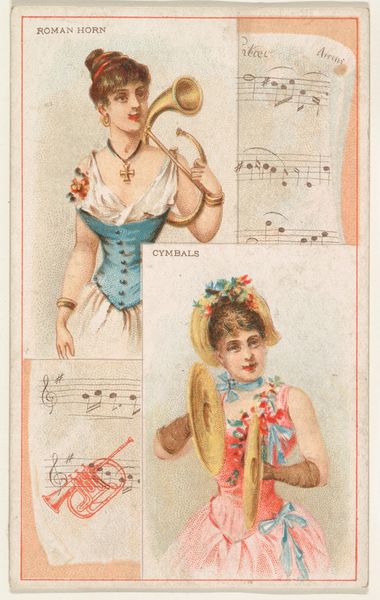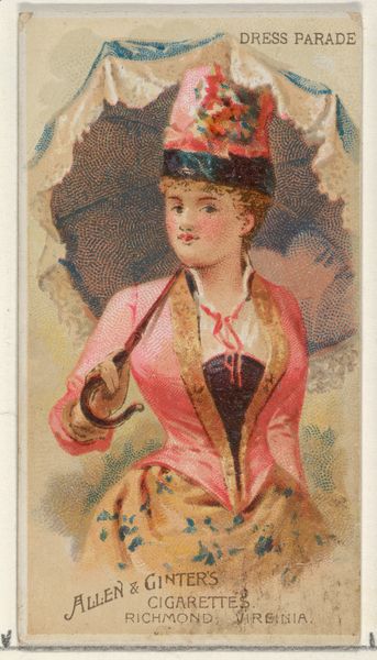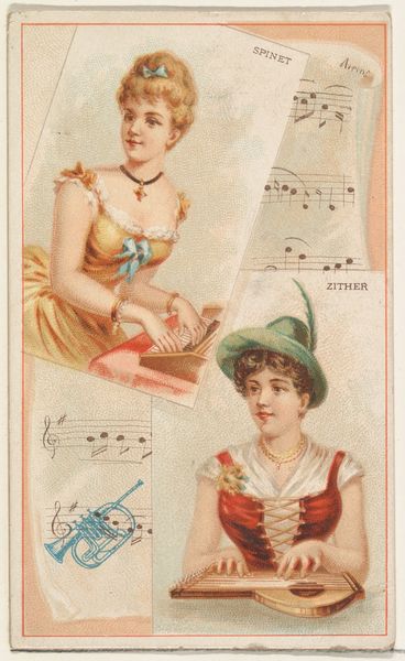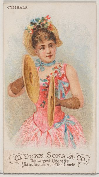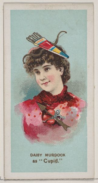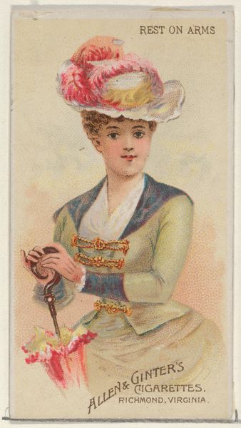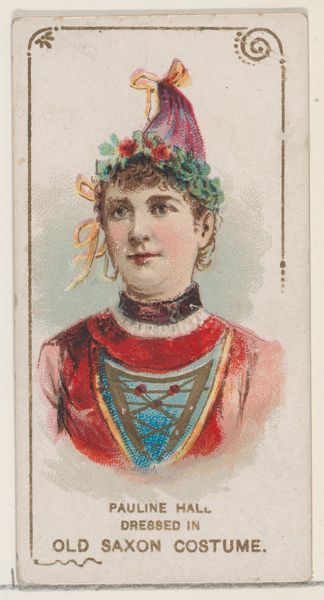
Tumblers and Bells, from the Musical Instruments series (N121) issued by Duke Sons & Co. to promote Honest Long Cut Tobacco 1888
0:00
0:00
drawing, coloured-pencil, print
#
portrait
#
drawing
#
coloured-pencil
#
water colours
# print
#
figuration
#
historical fashion
#
coloured pencil
#
decorative-art
Dimensions: Sheet: 2 1/2 × 4 1/16 in. (6.4 × 10.3 cm)
Copyright: Public Domain
Curator: I'm immediately drawn to the juxtaposition of these two women – one poised with crystal tumblers, the other with a collection of gleaming handbells. There's a striking stillness to the whole composition. Editor: That’s an interesting initial response, and certainly something we can dig into further. This print, "Tumblers and Bells," hails from a series of trade cards issued around 1888 by W. Duke, Sons & Co. to promote their Honest Long Cut Tobacco. Each card in the “Musical Instruments” set showcased a different combination of musical tools and refined feminine virtue, contributing to a narrative about consumerism and idealized femininity. Curator: So, the context is key here—linking consumption of tobacco with certain societal expectations for women of that period? How fascinating that these seemingly unrelated objects converge to paint a complex picture of gendered expectations in a commercial setting! The juxtaposition itself feels loaded, doesn't it? The "tumblers" suggesting performance, perhaps illusion, alongside the more straightforward musicality of the "bells." Editor: Absolutely. Consider also the visual details. The ‘tumblers’ woman is draped in a light patterned fabric and sits alongside music while the ‘bells’ woman has a tightly laced, corseted look, all ornament and structure; both indicative of constructed, performed identities. They are performing the roles designated for women. The presence of musical instruments connects back to Duke’s branding but, arguably, there is a deeper interplay here about leisure and expectation. Curator: From a purely visual perspective, the color palette—soft pastels punctuated by bolder accents like the bell-ringer’s corset—creates a very pleasing sense of balance, of constructed harmony almost. Each object is rendered so precisely, so distinctly. The shine of the bells is captured particularly well using colored pencil on a mass produced advertisement! Editor: Agreed, the visual allure is undeniable, it reinforces the desire, both literally for tobacco and culturally for aspiration, but it’s hard not to see it as a representation of women constrained to specific social scripts dictated in a heavily commodified environment. It compels us to consider these constructs, doesn't it? Curator: It does indeed. Thinking about it, seeing both women, the card becomes more than an advert: it's a mirror reflecting back to us these carefully crafted constructions of beauty and virtue, reminding us that those very categories remain shaped and informed by market forces. Editor: Well said. Ultimately, whether examining the symbolism or decoding the color interplay, there is more to this little advertising print than might first appear.
Comments
No comments
Be the first to comment and join the conversation on the ultimate creative platform.
