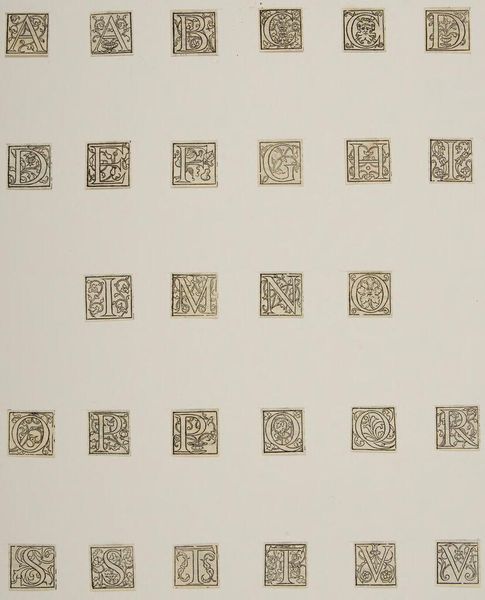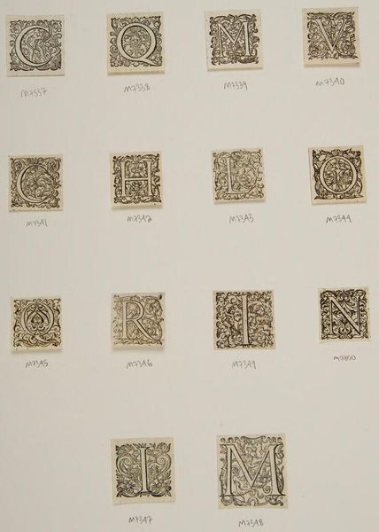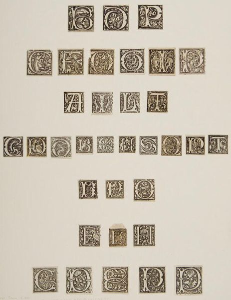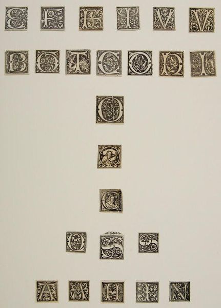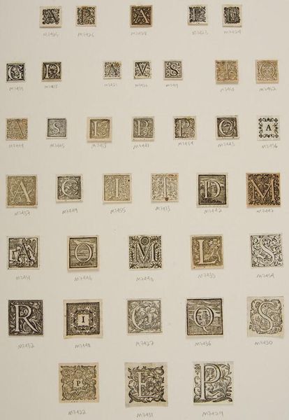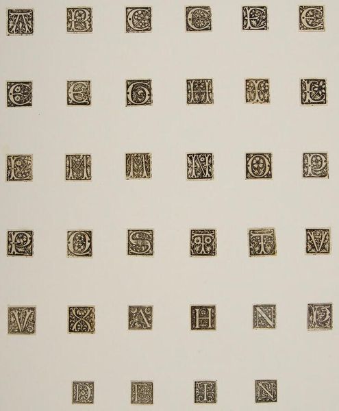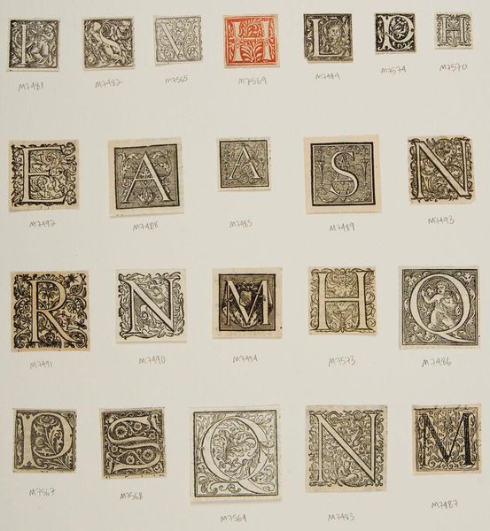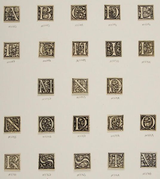
c. 16th century
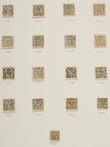
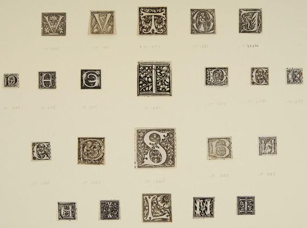
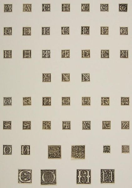
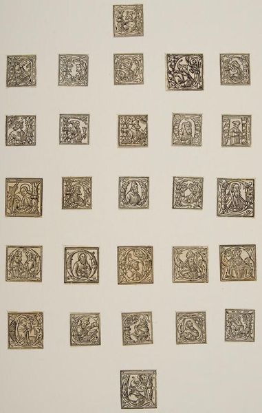
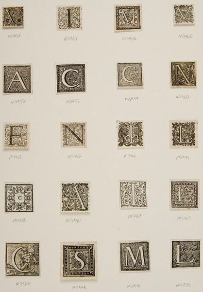
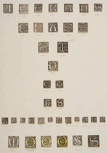
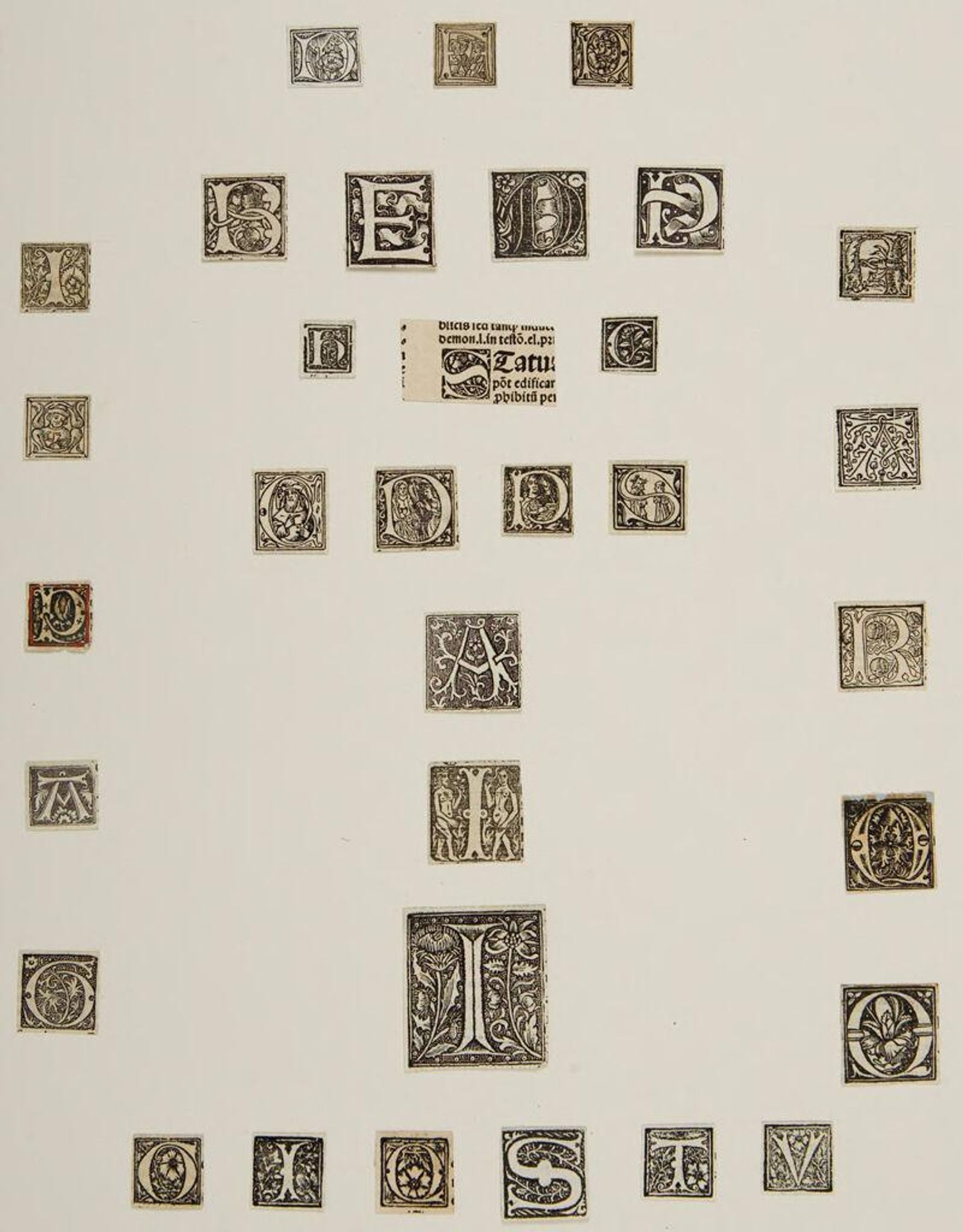
Letter D
Listen to curator's interpretation
Curatorial notes
Editor: This intriguing piece, simply titled "Letter D" by an anonymous artist, showcases a collection of letterforms. The composition is quite striking; the letters are arranged almost like a gradient, and I'm curious about the artist's intention behind this layout. What do you make of the visual relationships between these letterforms? Curator: The arrangement presents a compelling study in form and texture. Observe how the negative space interacts with the dense, graphic quality of each letter. The varying sizes create a visual rhythm, while the uniformity of the square format emphasizes the individual character of each glyph. Consider the semiotic potential: are these letters merely aesthetic forms, or do they hint at a deeper, perhaps coded, meaning? Editor: That's fascinating. I hadn't considered the potential for coded meaning within the arrangement itself, but it certainly adds another layer to the work. Thanks for sharing your insights! Curator: My pleasure. Remember, the interplay of form and content invites endless interpretation.