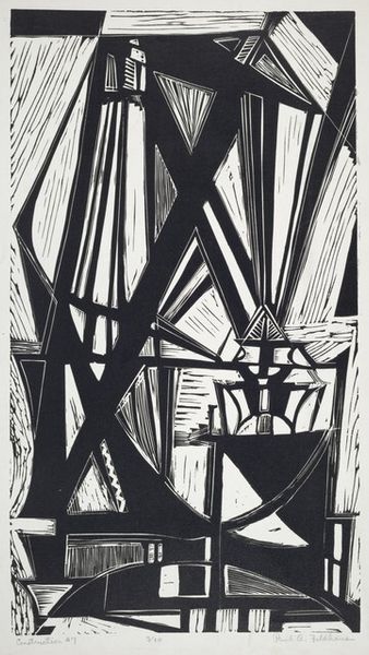
Dimensions: image: 22.9 × 32.4 cm (9 × 12 3/4 in.) sheet: 29.8 × 41.3 cm (11 3/4 × 16 1/4 in.)
Copyright: National Gallery of Art: CC0 1.0
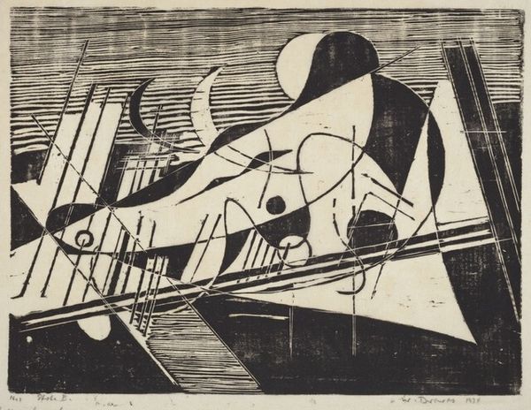
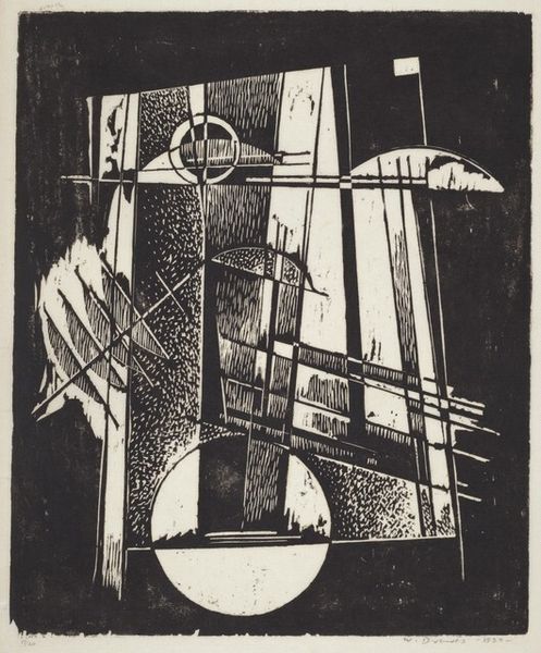
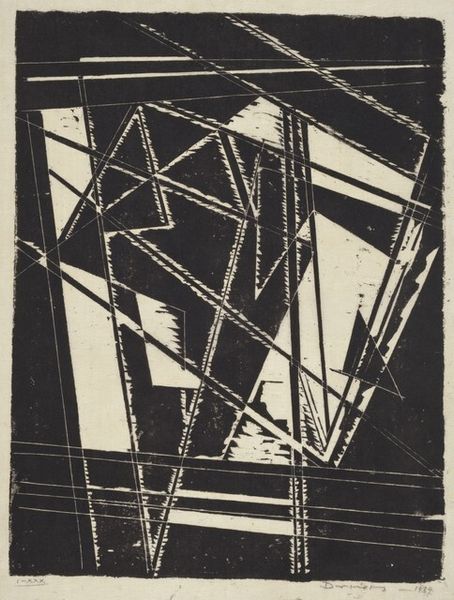
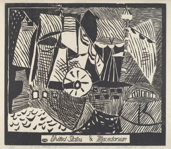
Curator: Before us we have "Composition III - Arrows Into Different Directions" crafted in 1934 by Werner Drewes. The print is a woodcut and displays an array of geometric shapes. Editor: My first thought is controlled chaos. The textures vary so much – from the almost stippled background to the bold lines suggesting motion. The contrast makes me a little uneasy; there's tension. Curator: The term woodcut refers to the printing process involving carving an image into a wooden block, then inking the surface for printing. Considering Drewes’s roots were deeply intertwined with the Bauhaus movement and later his involvement in the WPA’s Federal Art Project here in the US, his embrace of printmaking reflects an ethos of accessibility and mass production, as well as being born of simple available materials. The question for me is: did the act of carving allow the hand, and physical presence to imbue an additional layer to the art. Editor: Absolutely. Even with the geometric rigidity, those 'arrows,' and shapes, there’s an inherent vulnerability communicated by handcraft. For me, the directional arrows create a narrative suggesting journeys, and even diversions from specific life choices and perhaps that is what the artist was expressing by choosing to create woodcuts. There’s a dynamic interplay here; a very subtle symbolism around pathways, choices. Curator: Your interpretation of directional tension chimes with Drewes’ life – displaced from Germany due to the rise of the Nazi Party and forced to resettle in America, a story echoed by many Bauhaus alumni. But consider also how this print, like all prints, creates multiples – making this design infinitely repeatable; it can also be considered a design statement of order and industry. How does this play with its original reception do you think? Editor: Perhaps this piece acted as a visual reassurance during a period of flux for both artist, and art appreciator alike. By creating pathways in a piece so bold yet comforting, it's perhaps about forging one’s destiny amidst disarray, I find. And that black ink used everywhere reinforces the drama of it all, but this could easily be read differently. Curator: That said, seeing the production aspects and material choice brings fresh ideas and insight into the visual expression, as much as how it's meant to act as signifier. Editor: I completely agree – that dialogue is essential.
Comments
No comments
Be the first to comment and join the conversation on the ultimate creative platform.
More like this