drawing, paper, ink, pen
drawing
aged paper
hand-lettering
ink paper printed
hand drawn type
paper
personal sketchbook
ink
hand-drawn typeface
ink colored
pen work
sketchbook drawing
pen
sketchbook art
Copyright: Rijks Museum: Open Domain
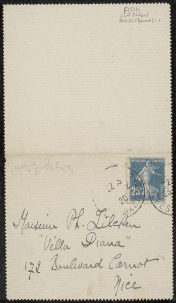
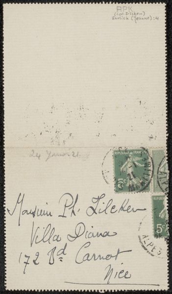
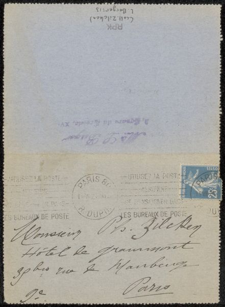
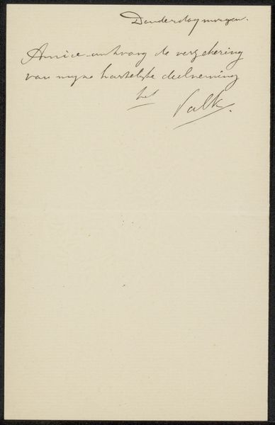
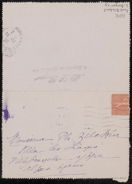
This "Brief aan Philip Zilcken" was made by Jeanne Erlich, likely with ink on paper in 1921. Right away, what hits me is the directness of the marks. They aren't trying to hide the process. The paper has a creamy, off-white color, and you can almost feel its texture. The dark ink creates a strong contrast, making the words jump out. The way Erlich writes, it's like each letter is a little gesture. Look at the loops in "Boulevard Carnot." They have this energy, like a dance. The letters vary in thickness, which makes it feel like the artist was really present, varying the pressure as she wrote. I love how the address is so specific, while the artist's intentions remain open. It reminds me a bit of Cy Twombly's work, where writing becomes drawing and meaning is layered and intuitive. "Brief aan Philip Zilcken" invites us to embrace ambiguity and find our own connections in the simple act of mark-making.
Comments
No comments
Be the first to comment and join the conversation on the ultimate creative platform.