About this artwork
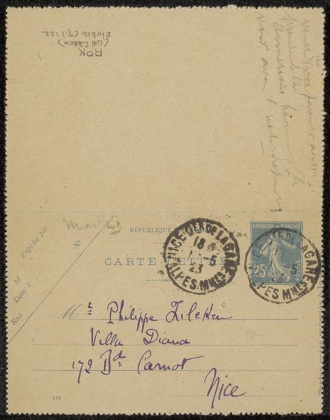
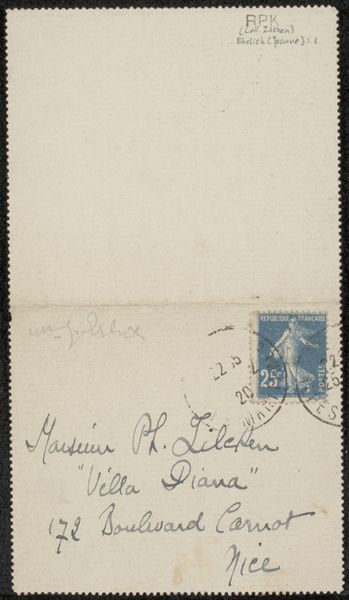
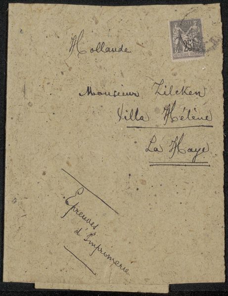
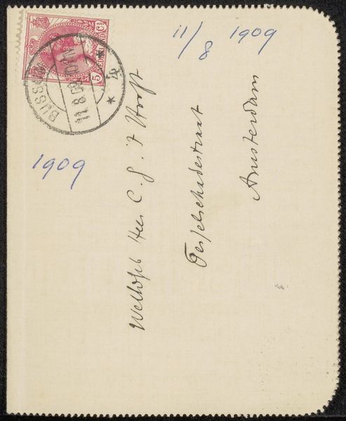
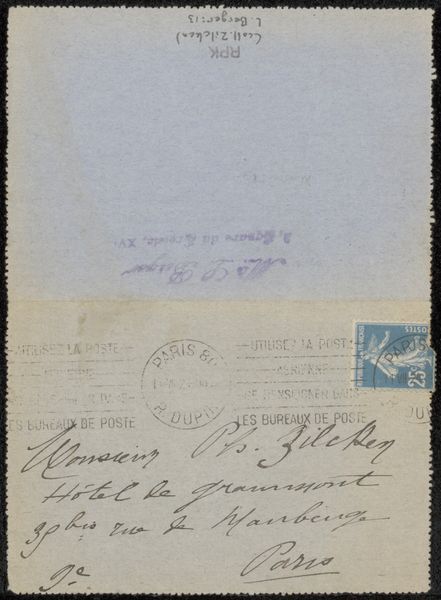
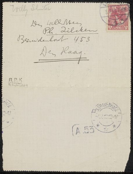
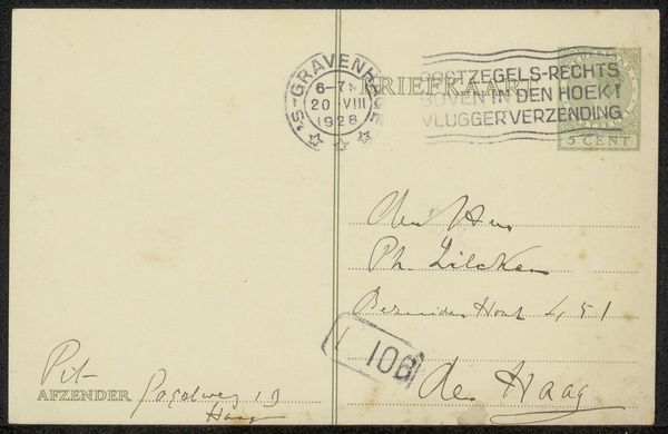
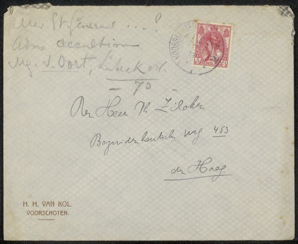
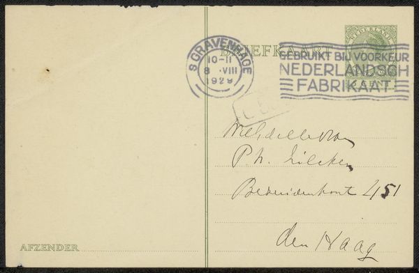
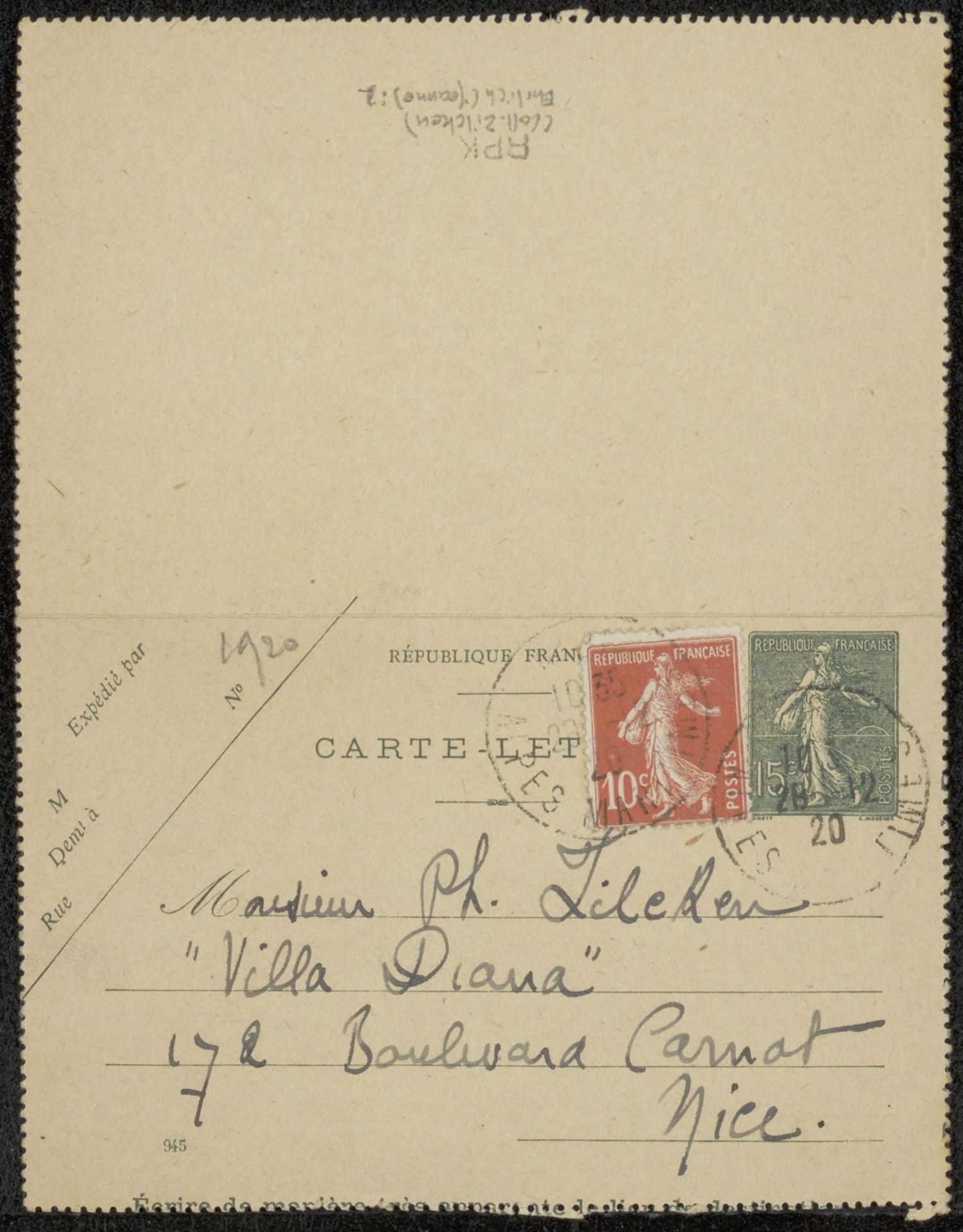
This is a postcard to Philip Zilcken, and from what I can see, it was made in 1920. It's not a painting, but the handwriting really brings it to life. Look at the way the address is written; it’s so personal, with a kind of casual elegance. I love how the ink almost bleeds into the paper, giving it this soft, blurry edge. You can feel the texture of the paper itself, aged and worn from being handled and sent through the mail. It’s like the writing becomes part of the paper, not just sitting on top of it. Notice also that there is no defined space for the address, the writer just dives in and starts writing. There’s something really intimate about handwriting, isn't there? You see someone's personality in the way they form their letters. It reminds me a little of Cy Twombly, but with more intention. It really shows you that art doesn't always have to be about making something; sometimes, it's just about communicating and leaving a trace of yourself.
Artwork details
- Medium
- mixed-media, print, paper, ink
- Copyright
- Rijks Museum: Open Domain
Tags
Comments
Share your thoughts
About this artwork
This is a postcard to Philip Zilcken, and from what I can see, it was made in 1920. It's not a painting, but the handwriting really brings it to life. Look at the way the address is written; it’s so personal, with a kind of casual elegance. I love how the ink almost bleeds into the paper, giving it this soft, blurry edge. You can feel the texture of the paper itself, aged and worn from being handled and sent through the mail. It’s like the writing becomes part of the paper, not just sitting on top of it. Notice also that there is no defined space for the address, the writer just dives in and starts writing. There’s something really intimate about handwriting, isn't there? You see someone's personality in the way they form their letters. It reminds me a little of Cy Twombly, but with more intention. It really shows you that art doesn't always have to be about making something; sometimes, it's just about communicating and leaving a trace of yourself.
Comments
Share your thoughts