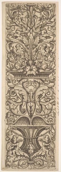
drawing, graphic-art, ornament, print, metal, engraving
drawing
graphic-art
ornament
pen drawing
metal
11_renaissance
line
history-painting
northern-renaissance
engraving
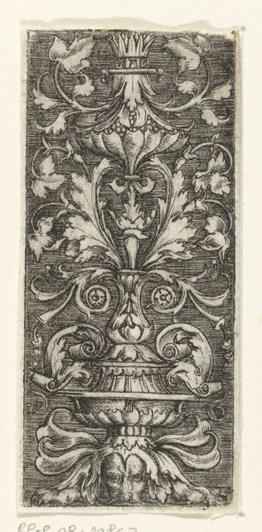
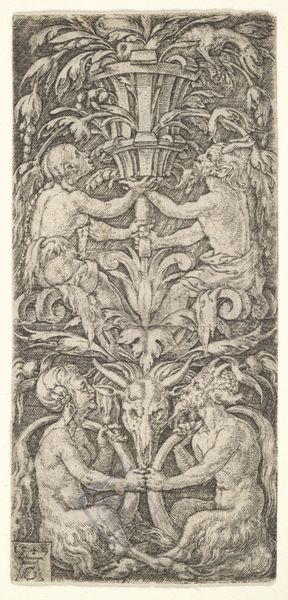
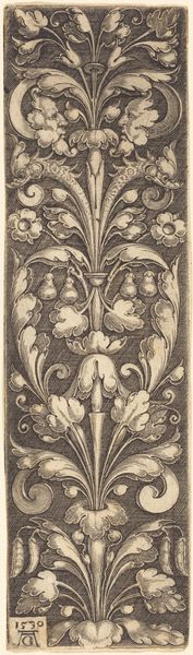
Dimensions: height 87 mm, width 31 mm
Copyright: Rijks Museum: Open Domain
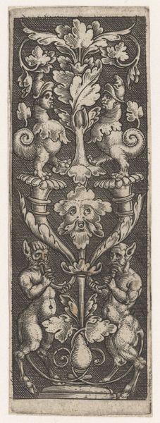
Curator: Looking at this engraving, there's an immediate sense of… organized chaos. It feels both intricate and slightly unsettling. Editor: Indeed. What strikes me is how Monogrammist AC, sometime between 1520 and 1562, manipulated materials like metal to produce this compelling ornamental graphic. It’s part of the Rijksmuseum collection, titled "Ornament met twee zeedieren en twee slakken"—Ornament with two sea creatures and two snails. Curator: The linework is astonishing. Notice how each creature, each leaf, each curve contributes to this overall pattern? It is a highly refined sense of organization that is very deliberate, it also brings to mind a discussion on semiotics. Editor: Absolutely. And the sheer labour involved! Each line meticulously etched to create a matrix that could reproduce this image many times over. What did this do for dissemination? Consider the function of graphic art as a source to learn craft or to inspire interior designs. Curator: The creatures themselves feel symbolic—those grotesque masks contrast with the naturalistic rendering of the foliage above and snail below, so where did this aesthetic choice spring from? Editor: One might propose it echoes the complex relationship between humanity and nature during the Renaissance. I note that it's not just a drawing, it is graphic art designed as a functional ornament as well as an example of art. This speaks to how materials influence art. Consider who commissioned this engraving. What workshops collaborated? Curator: And consider how this very function influences its aesthetic! The symmetrical arrangement lends itself well to the mass production afforded by printmaking. The use of symmetry creates visual equilibrium in spite of this strange group of organisms, this balance in design. Editor: This particular piece provides an exciting snapshot into both material production techniques and the visual lexicon of the era. We could spend much more time here considering what the impact was of each copy produced and sold or traded within the networks. Curator: Exactly. It demonstrates that artistic achievement rests on aesthetic design choices, as well as production techniques. The convergence is something to think about and reflect on further, thank you.
Comments
No comments
Be the first to comment and join the conversation on the ultimate creative platform.
More like this