Copyright: CC0 1.0
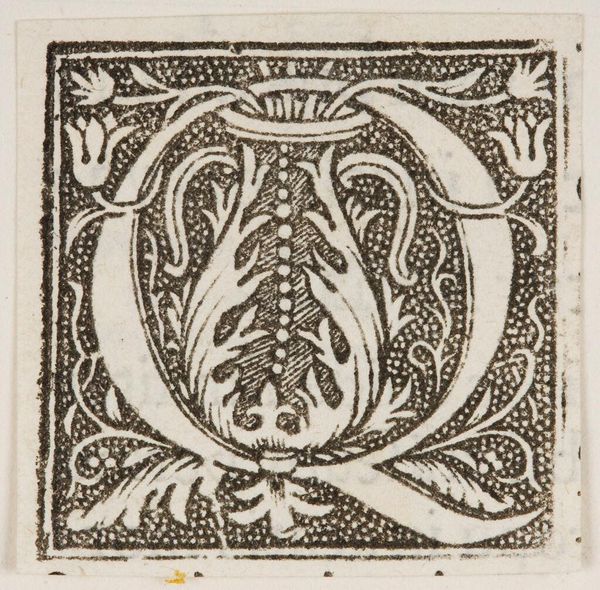
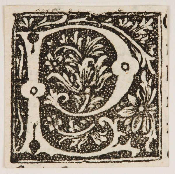
Editor: Here we have "Initial Q," created by an anonymous artist. It's a small block print, and the high contrast between black and white gives it a bold presence. What do you see in this piece, considering its formal elements? Curator: The stark black and white contrast immediately establishes a visual hierarchy, focusing attention on the letterform. Note the tension between the geometric structure of the 'Q' and the organic, floral motifs nestled within. This juxtaposition generates a dynamic interplay between order and nature. Editor: The floral designs almost seem to fight against the rigid lines of the letter. Curator: Precisely. The composition invites contemplation on the dialectic between structure and ornamentation, and whether one element truly dominates the other. Editor: That tension between the geometric and organic really makes you consider the piece's elements more closely. Curator: Indeed; the rigorous visual analysis reveals the careful construction of meaning through form itself.
Comments
No comments
Be the first to comment and join the conversation on the ultimate creative platform.
More like this