drawing, paper, ink
#
drawing
#
allegory
#
classical-realism
#
paper
#
ink
#
geometric
#
decorative-art
Dimensions: height 164 mm, width 215 mm
Copyright: Rijks Museum: Open Domain
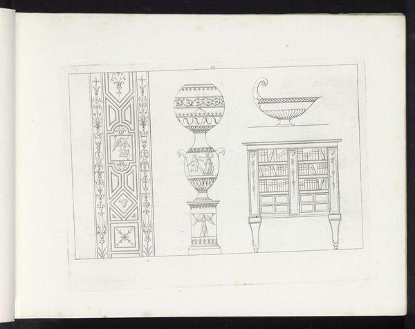
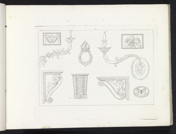
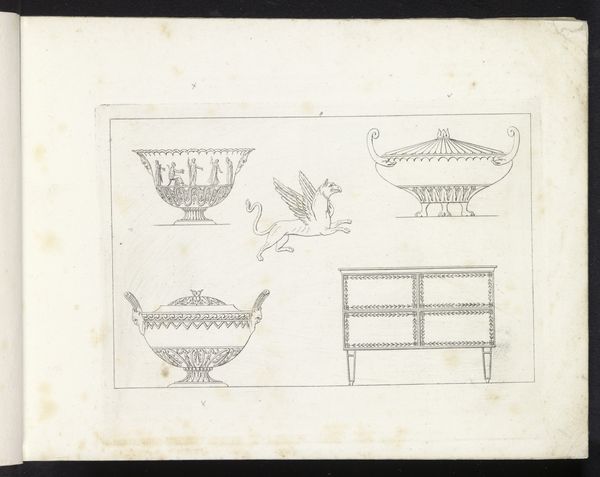
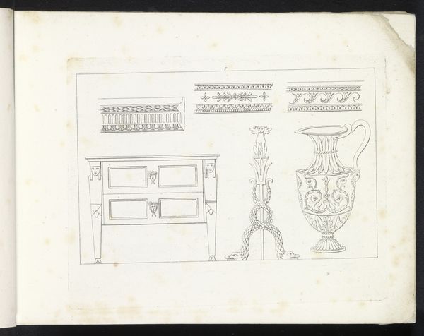
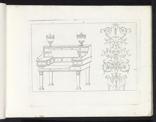
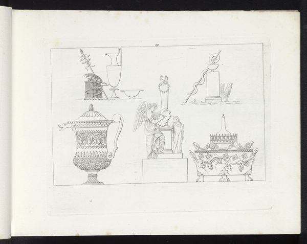
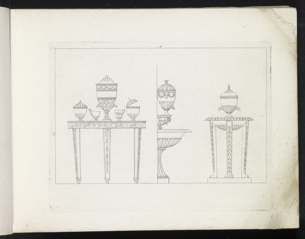
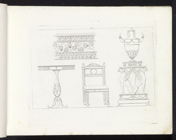
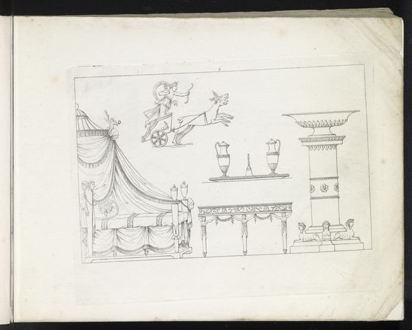
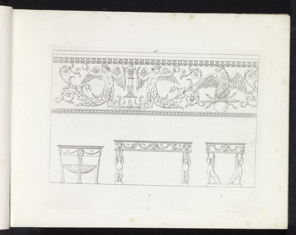
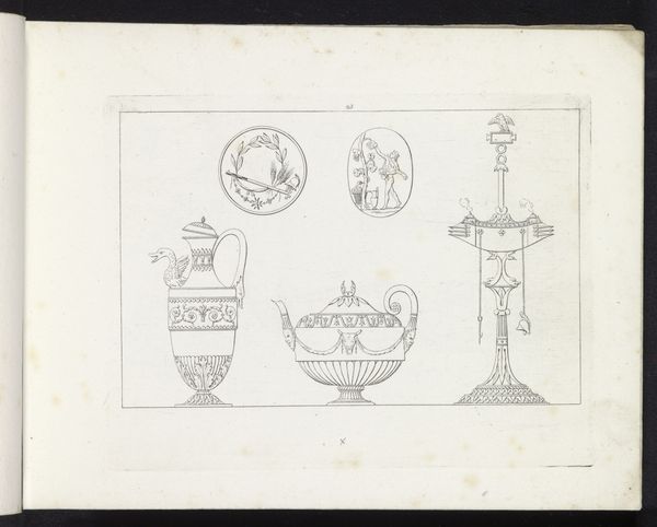
Curator: Here we have "Fries met putti in rijtuigen, een schaal en een bankje," a drawing by Pietro Ruga, created in 1817 using ink on paper. It showcases designs for decorative arts. What’s your initial impression? Editor: The lightness is remarkable. The sparse linework and unadorned background give it a distinctly airy quality. I am fascinated by how little ink can evoke so much classical allusion. It reads like a carefully considered proposal. Curator: Absolutely. Ruga's choice to depict putti in chariots immediately calls upon a visual language rooted in Roman and Greek mythology, these figures are often seen as representations of love or divine messengers, think Cupid. Their appearance lends an allegorical weight. Editor: The material aspect highlights the societal function of design itself, doesn't it? By translating mythology onto utilitarian objects, like the proposed furniture and decorative frieze, we can think about who has access to myth and luxury, as they are made interchangeable, one in the same, for elites. Curator: Precisely. It shows how classical imagery was employed in early 19th-century design, indicating a continuity of cultural values and perhaps a desire to connect with an idealized past. The imagery served a symbolic purpose within the domestic sphere. Editor: Do you think that the ink itself might signal to those clients for whom these sketches were created some semblance of value? Consider how its labor would relate to these wealthy potential customers. Ink was often difficult to make. Curator: That’s insightful. It’s very possible that the particular refinement and detail made possible by ink would be associated with wealth and good taste, adding another layer to the social significance of the designs. The monochrome, clean lines exude elegance and would’ve surely impressed. Editor: Yes, the ink itself, more than the putti even, points us toward networks of commodity and wealth. Thanks for highlighting its cultural impact for me! Curator: Thank you for drawing attention to those key considerations! I’m walking away today with more appreciation of the artistic strategies underlying social positioning through household adornment.
Comments
No comments
Be the first to comment and join the conversation on the ultimate creative platform.
More like this