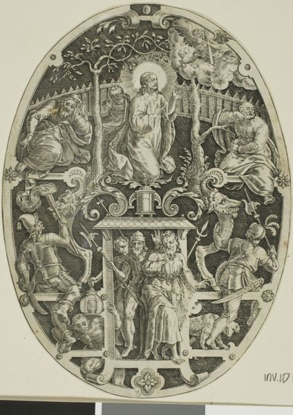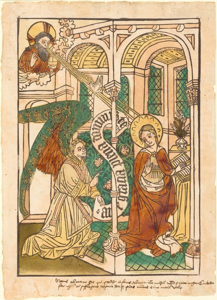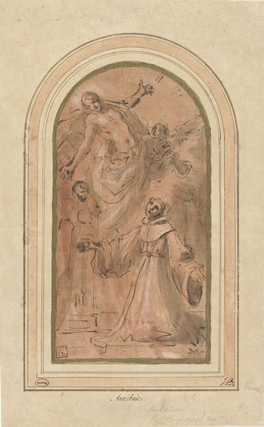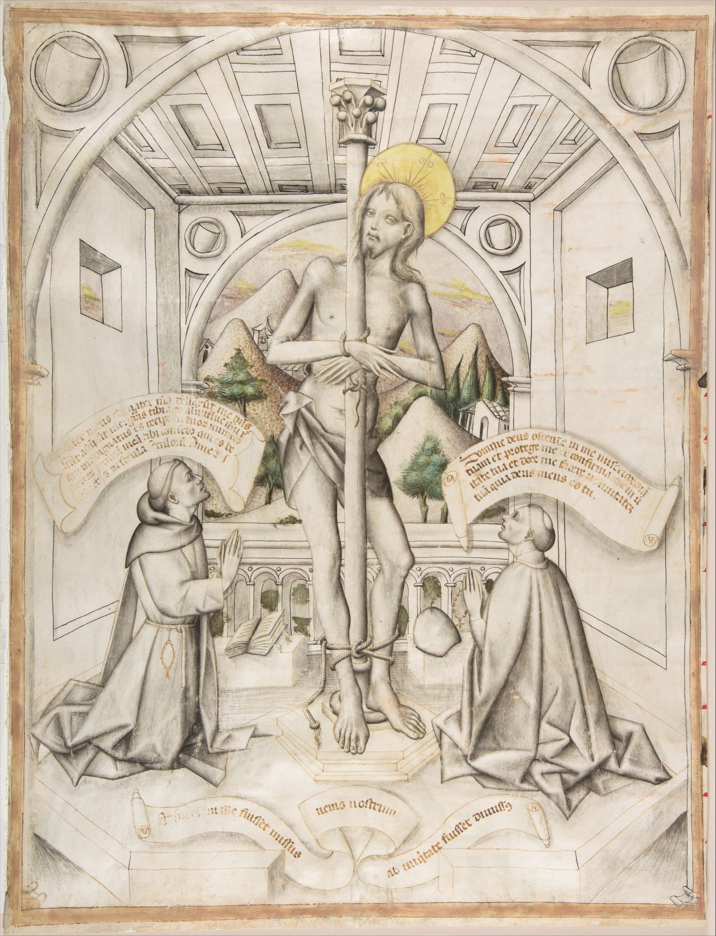
1435 - 1445
Christ at the Column
Listen to curator's interpretation
Curatorial notes
Editor: Here we have "Christ at the Column," made around 1435-1445 by the Delli brothers. It’s currently held at the Metropolitan Museum of Art. This work is striking with its stylized forms and unusual color palette. I’m intrigued by the linear precision juxtaposed with the emotional weight of the subject. What do you see in this piece from a formalist perspective? Curator: Indeed. From a formalist standpoint, let us observe the composition: the verticality of Christ's figure anchored by the column is countered by the kneeling supplicants and the horizontally stretched text. Notice how the Delli brothers employed a restricted palette, primarily linear draughtsmanship with subtle washes. What effect does this have on the viewer's reading of the form? Editor: I see how the lack of vibrant color really focuses attention on the lines themselves, giving it a sense of austerity. It almost feels like a blueprint for a sculpture. Curator: Precisely. The linear quality underscores the geometric structure inherent in the architectural background, drawing our attention to the calculated arrangement of forms within the pictorial space. The interplay of light and shadow, although subdued, accentuates the volume of Christ’s body. It highlights the physicality amidst the otherwise stylized rendition. Are there semiotic readings you find intriguing based on the composition itself? Editor: The scrolls are visually balanced but the text seems illegible. Is their form more important than their textual meaning? Curator: That’s a sharp observation. The illegibility foregrounds the signifier—the visual form of writing—over the signified—the meaning of the text. They are shapes within the broader design, adding visual texture and directing the viewer’s eye. Editor: So it's more about the look than the literal content! This focus on form over content offers a new lens through which to appreciate the piece. Curator: Indeed, understanding how the Delli brothers manipulated line, form, and composition deepens our appreciation beyond the narrative. Editor: I hadn’t considered the shapes and balance as deliberately until now!