tempera, print, paper, ink
#
narrative-art
#
tempera
# print
#
figuration
#
paper
#
ink
#
history-painting
#
italian-renaissance
#
early-renaissance
Dimensions: image: 27.1 x 19.3 cm (10 11/16 x 7 5/8 in.) sheet: 31.5 x 22.7 cm (12 3/8 x 8 15/16 in.) overall: 59.7 x 44.5 cm (23 1/2 x 17 1/2 in.)
Copyright: National Gallery of Art: CC0 1.0
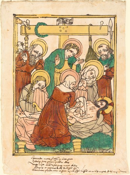
Editor: This is "The Annunciation," made with tempera, ink, and print on paper around 1450-1470 by an anonymous artist during the Italian Renaissance. The first thing I notice is how flat everything looks; the artist seems more interested in clear outlines than realistic depth. What catches your eye, from a formal perspective? Curator: The most striking formal element is the interplay of linear and planar forms. The architecture, the figures, and even the divine rays are defined by strong, unwavering lines. However, within those boundaries, we observe subtly modulated washes of color, particularly in the drapery and the angel's wings, creating flat, yet contrasting surfaces. This tension between line and plane establishes a pictorial structure which is somewhat unique for its time. What effect do you believe the inscription on the banner creates within the overall design? Editor: It seems to act as a visual bridge connecting the angel Gabriel to Mary, but its spiraling form is very unusual. I'm curious if it's meant to break up the strict geometry elsewhere? Curator: Precisely. Observe how the text spirals around the central column, disrupting the otherwise orthogonal composition. This serpentine form introduces a dynamic counterpoint to the rigidity of the architectural elements. This suggests the introduction of the divine into the earthly realm. What do you make of the choice to render God the Father in the upper-left corner, visually separate from the primary scene? Editor: The placement of God the Father is strategic, he appears removed and framed, which I guess reinforces a divine hierarchy while maintaining the narrative's central focus on Mary and Gabriel. The perspective makes a statement about their relationship. Curator: Precisely, the artist’s visual language guides our reading of this narrative moment. Reflecting on this print, it reveals itself to be a delicate negotiation between the ethereal and the concrete, utilizing linearity and colour to define the boundaries of the scene, whilst using text to subtly destabilise this otherwise ridged architectural rendering. Editor: It’s amazing how a formal reading illuminates aspects that historical context alone might miss.
Comments
No comments
Be the first to comment and join the conversation on the ultimate creative platform.
