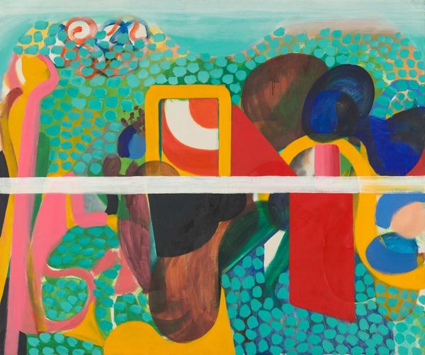
painting, acrylic-paint
#
abstract-expressionism
#
abstract expressionism
#
painting
#
pop art
#
acrylic-paint
#
geometric
#
abstraction
#
pop-art
Copyright: Emma Amos,Fair Use
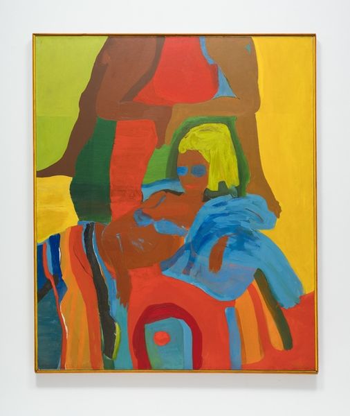
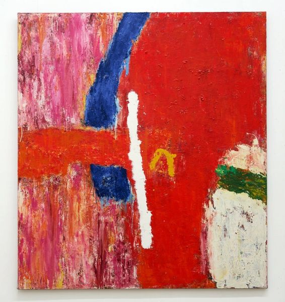
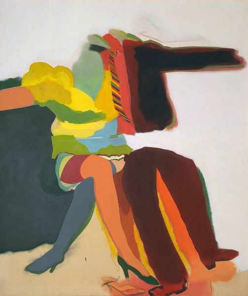
Curator: Right, let’s dive into this work. We’re looking at Emma Amos's "Blue Balls," created in 1964, executed in acrylic paint, and firmly situated within the abstract expressionist movement, yet also displaying compelling Pop Art leanings. Editor: Woah. Immediate reaction? Organized chaos. It feels like a dreamscape, but one where someone's meticulously sorted the blocks before scattering them. I see… shapes fighting for attention. Is that a necktie floating there? Curator: The tension between carefully delineated areas of color and a more liberated, gestural application of paint is precisely what I find compelling here. Notice how the planes of orange and green push forward, while the titular "blue balls" seem almost incidental. The work resists easy interpretation. We could even decode it using semiotics! The colors might symbolize emotions, or political ideas in ways we haven't unpacked yet... Editor: Semiotics aside, that big blue form also brings to mind a Rorschach test… you see what you want in it, right? But then, those bright, almost childlike blocks of color juxtaposed with those deeper browns and oranges – there's a deliberate imbalance that speaks to some deeper discord, don’t you think? What about her choice to use acrylics, was that typical for her at the time? Curator: In 1964, the usage of acrylics provided artists with quicker drying times. This medium allowed for layered reworking, or swift, bold applications of vibrant colors which, you are right to point out, play a key role here. You could also look at structural elements: horizontal, vertical… even a kind of implicit grid beneath it all. How that grid is broken creates the tensions which form the basis of the art, like any canvas work, any system. Editor: Yeah, I am interested to consider the artist’s state of mind when producing such artwork, right? It's almost mocking itself with this bizarrely calm dissonance. This painting really throws a wrench into the notion of straightforward representation. The name itself has humor that makes it stand out! Curator: Yes, yes... Well, that is a very fine initial take! As for the structural framework, in short this visual approach facilitates analysis. This can clarify a deep art! Editor: "Deep Art!" Haha, so, while you see a canvas meticulously following compositional codes, I see, an organised yet confusing, and maybe a very intimate personal revolt in colour... Thanks for digging deeper together! Curator: An exchange fruitful indeed! One hopes our brief discussion offered something!
Comments
No comments
Be the first to comment and join the conversation on the ultimate creative platform.
More like this