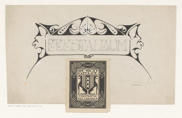
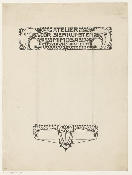
Ontwerp voor een vignet van Bureau voor Reclame en Versieringskunst Mimosa 1884 - 1952
0:00
0:00
drawing, graphic-art, typography
#
drawing
#
graphic-art
#
art-nouveau
#
script typography
#
hand-lettering
#
old engraving style
#
hand drawn type
#
hand lettering
#
personal sketchbook
#
typography
#
hand-drawn typeface
#
geometric
#
line
#
sketchbook drawing
#
storyboard and sketchbook work
#
sketchbook art
Dimensions: height 115 mm, width 148 mm
Copyright: Rijks Museum: Open Domain
This is Reinier Willem Petrus de Vries’ design for a logo for the Bureau voor Reclame en Versieringskunst Mimosa, and it’s made with ink on paper. It’s all about the curves here, right? The way the lines bend and flow, it feels so intentional. The piece uses these bold black strokes to define the text and decorative elements, and you can almost feel the artist carefully inking each line. Look at the space between the letters, the way the shapes balance each other. This design is all about making a statement, grabbing your attention with its clean, precise lines. Then there's those little dots and flourishes that add a touch of whimsy, a little bit of personality to the whole thing. It reminds me a bit of Aubrey Beardsley’s work, with that same kind of Art Nouveau sensibility. There's a tension between simplicity and ornament, which is what art is all about: embracing the push and pull of ideas, the endless possibilities.
Comments
No comments
Be the first to comment and join the conversation on the ultimate creative platform.
More like this