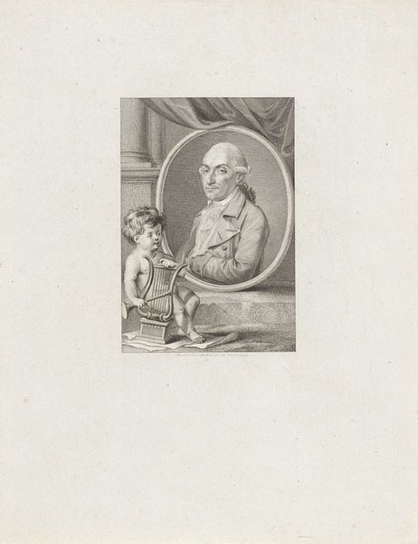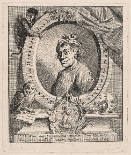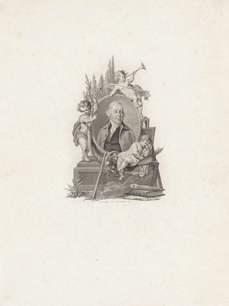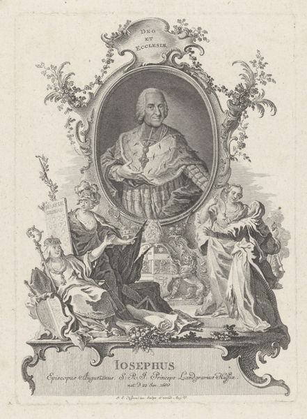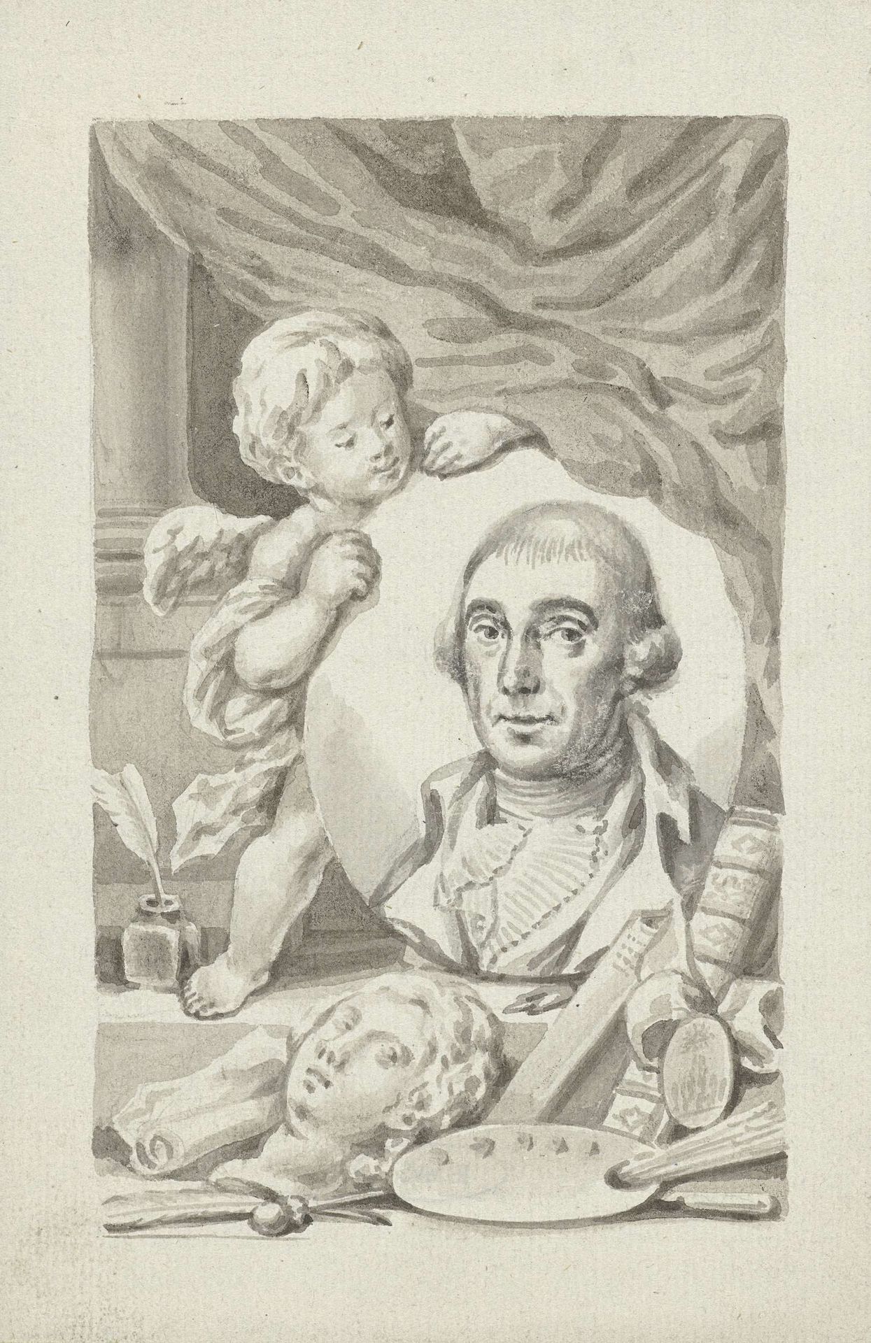
c. 1757 - 1819
Putto met portretmedaillon van een kunstenaar
Listen to curator's interpretation
Curatorial notes
Editor: This drawing, “Putto with Portrait Medallion of an Artist” by Roeland van Eynden, was created sometime between 1757 and 1819 using ink on paper. It's quite striking, a monochrome tableau. I’m immediately drawn to the composition; there’s so much going on! How do you interpret this piece, particularly in terms of its formal elements? Curator: Initially, consider how the artist uses line. Note the distinct difference in the rendering of the putto compared to the more defined lines of the portrait medallion. The softness of the putto is created through delicate, almost feathery lines, imbuing it with a sense of ethereal grace. The hard edges and detailed hatching on the portrait lend it a sense of authority and presence, creating a captivating visual tension. Editor: I see that. So, the contrast isn't just in the subject matter, but how they’re depicted…almost like two separate realities intersecting? Curator: Precisely! Further, consider the deployment of tonal values. The artist uses chiaroscuro - the sharp contrast between light and shadow - to give depth and volume to the forms. Notice how the darkest tones are strategically placed to emphasize the contours and details, thereby drawing the eye to crucial focal points within the composition. Does the orientation of each compositional element matter, would you say? Editor: Definitely! The artist is drawing attention to certain attributes; for instance the angle and placement of the drawing implements and partially-finished head may be intended as self-promotion. Thanks for sharing your expertise. I'm taking away how a piece's inherent design features—such as light, line, and subject selection--make for an amazing experience when well executed. Curator: Indeed. Observing how those features converge in art enhances how we discuss and interpret artwork.