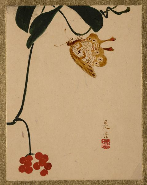
Olive, from the Fruits series (N12) for Allen & Ginter Cigarettes Brands 1891
drawing, coloured-pencil, print
portrait
drawing
art-nouveau
coloured-pencil
figuration
coloured pencil
art nouveau
Dimensions: Sheet: 2 3/4 x 1 1/2 in. (7 x 3.8 cm)
Copyright: Public Domain
Curator: This artwork, titled "Olive, from the Fruits series (N12) for Allen & Ginter Cigarettes Brands," dates back to 1891. It's a colored-pencil print that was initially distributed as a collectible card. You can find it now in the collection of the Metropolitan Museum of Art. Editor: Well, my first thought is how surprisingly delicate it is. Almost melancholic. The muted colors, the bowed head… It’s like she's sharing a quiet moment with the olive branch. Curator: These cards were hugely popular, you see. Part of a late 19th-century phenomenon—cigarette cards used for advertisement. This particular set used the romanticism surrounding fruits and exotic women to brand a product. Consider how this "Olive" figure presents both natural abundance and feminine grace for a wide consumer audience. Editor: Right, the exoticized gaze is heavy here. But I'm still drawn to the artistry, despite the marketing intentions. Look at the textures achieved with colored pencil, especially in the headdress and jewelry. There’s a tenderness there, even if it’s packaged within a colonial mindset. It's interesting how the name “Olive” below acts as the name for both the woman and the fruit—as if the woman has been equated to this fruit, further contributing to this exoticization. Curator: Precisely. The visual strategy uses familiar artistic styles and poses common in the 19th century—think of classical portraits combined with Art Nouveau’s decorative sensibility. By incorporating a recognizable visual vocabulary, the card seeks acceptance. This allows cultural notions of beauty and worth to endorse their brand of cigarettes. Editor: You can almost taste the tobacco now that you point that out. It's funny, these were originally cheap ads tucked into cigarette packs, and now it is hung at The Met for all to view! But for me, that muted color palette, the dreamy rendering, that does possess an intriguing charm that transcends its origin as advertisement. Curator: Perhaps the card’s aesthetic quality is what enabled its institutional survival, leading it from mass culture towards becoming a unique display. But it remains crucial to acknowledge how this 'charm' historically benefited from societal imbalances that this museum implicitly aims to address today. Editor: A nice point. Something so innocent can have a darker layer! Food for thought for our listeners to take as they move onward.
Comments
No comments
Be the first to comment and join the conversation on the ultimate creative platform.