Curatorial notes
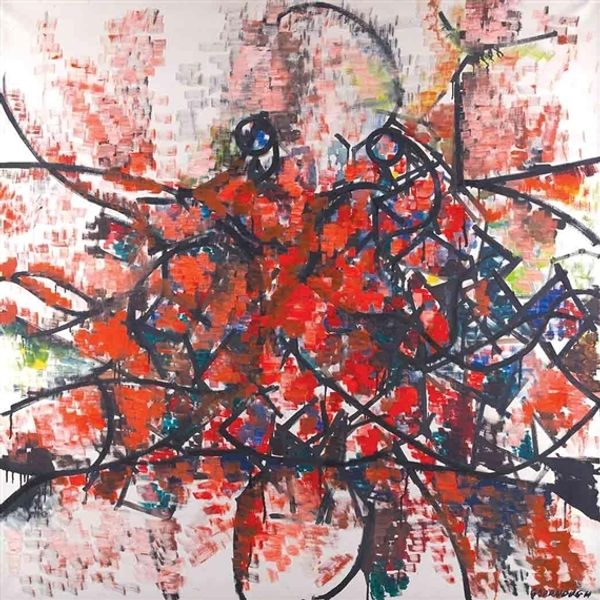
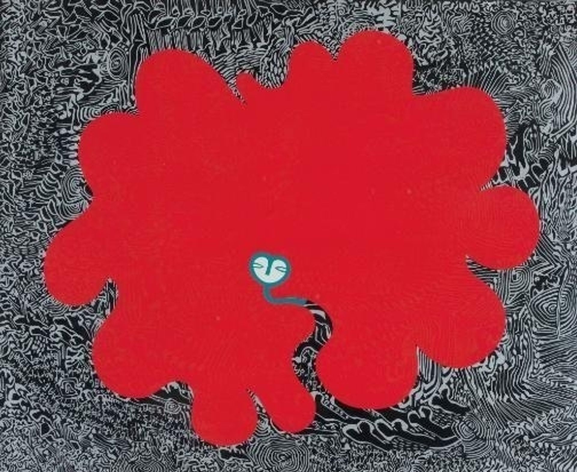
Curator: We’re looking at "Mythical Face", an acrylic painting by Walter Battiss. It's a vibrant explosion of colour against a detailed, almost frenetic backdrop. What's your immediate impression? Editor: A compelling tension. The flatness of that assertive red form clashes so strikingly with the textured, almost frantic, field behind it. The organic shape reads as both playful and unsettling due to the contrast. What sort of support and preparation went into making this painting, do we know what was used as the grounding material for example? Curator: The substrate upon which Battiss constructed this "Mythical Face" seems quite standard; it does however show some really interesting visual oppositions. That almost chaotic patterning in the background creates a visual rhythm that paradoxically emphasizes the static nature of the bold red form. There’s a semiotic interplay at work – the ground both defines and threatens to swallow the figure. Editor: Yes, swallow seems about right. It’s almost a raw materiality being expressed here. The application of paint, the density of pattern making and especially that dominant crimson. Red ochre pigment has had symbolic meaning throughout time within southern African art contexts and cultural heritage. Do we have details on where and when Battiss might have developed this technique of overpainting or masking? Curator: While precise documentation around his methods is scant, we can observe how his work frequently combines primal imagery with complex compositional structures. Take for instance the centrally positioned "face"; rendered so minimal as to seem almost an afterthought. It serves less as a focal point, and more as a disruption within the broader abstract composition. The face becomes just another layer embedded within the overall schema. Editor: An intriguing detail about that minimalist face is how its almost cartoon-like representation contrasts starkly with the intricate linework encompassing it. The means of applying paint, that deliberate flatness, alongside the very deliberate, fine line work suggests conscious exploration. It could even reference modes of industrial production – and perhaps hint at a reflection on the impact these forms might have had upon indigenous artistry. Curator: Precisely. It pushes beyond simple representation towards something that engages pure visual syntax. I think Battiss succeeds wonderfully in prompting a reconsideration of how visual elements interrelate, divorced from traditional constraints. Editor: It seems fair to state that Battiss uses what are ostensibly familiar materials in ways which confront the norms and expectations which viewers may have from encountering painting, thus allowing scope for deeper questions around process and content to be asked.