#
st-ives-school
Copyright: Terry Frost,Fair Use
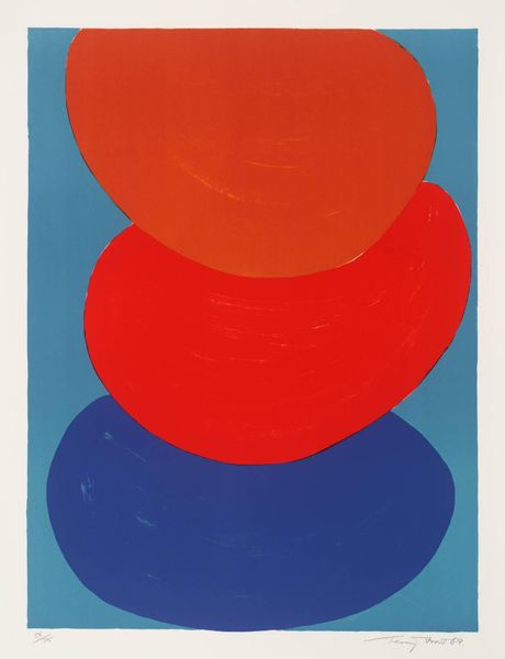
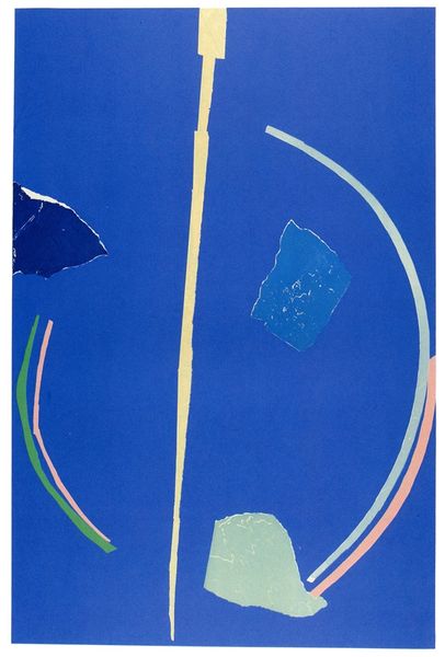
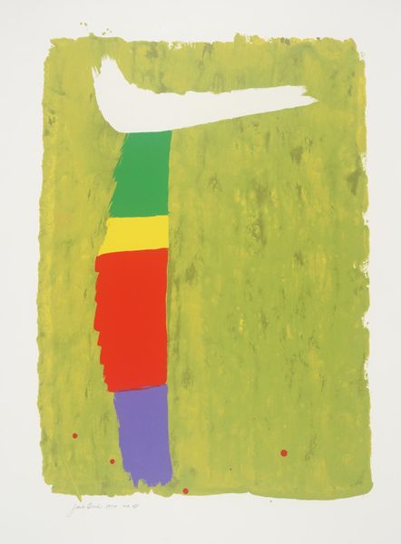
Terry Frost made this print called 'Moonship' with screenprint, and the way he's laid down the color feels really immediate, like he's figuring it out as he goes. I love the physicality of this piece. The colors are bold, opaque, and direct. Look at the way the shapes are stacked, each one split in two with different colors. It's almost like a playful experiment in color relationships, what happens when you put a red next to a blue, or a yellow next to a green? And then there’s that vertical slash cutting through the middle, raw and unrefined, that reveals the paper underneath, like a window. Frost’s use of bold colors reminds me a bit of Matisse’s cut-outs, a similar joy in pure color and simple shapes. But where Matisse is elegant, Frost is more earthy and raw. It’s all about the process, the doing, and the openness to wherever the paint takes you.
Comments
No comments
Be the first to comment and join the conversation on the ultimate creative platform.
More like this