Copyright: Public domain US
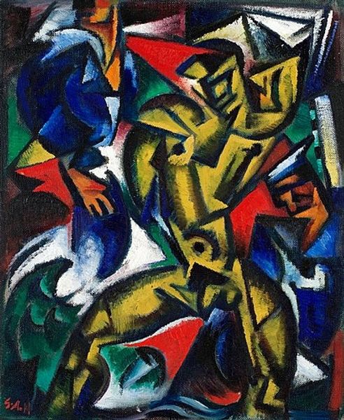
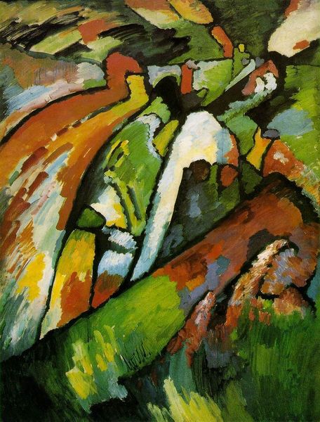
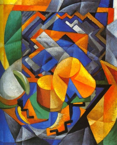
David Burliuk’s “Wind” is, like many paintings, an experiment in how color and form interact to make a feeling visible. The palette feels hot, like rust, but those cool blues make it sting a little, like windburn. I get the sense that Burliuk wasn’t trying to hide his moves here. It’s not about being slick, but about the push and pull of applying paint to canvas, and the freedom to leave the traces visible. There’s this cool, almost accidental line of white that shoots up the middle, like a streak of lightning or a sudden gust. It cuts right through the solid blocks of color, opening up the whole composition. He reminds me of Marsden Hartley in the way he uses bold colors to create a strong, emotional impact. But where Hartley is often about a kind of stoic, monumental feeling, Burliuk feels more raw, more immediate. Art is never about having the last word, but about keeping the conversation alive, right?
Comments
No comments
Be the first to comment and join the conversation on the ultimate creative platform.
More like this