print, engraving
comic strip sketch
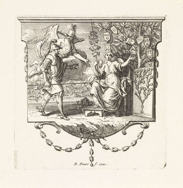
allegory
baroque
mechanical pen drawing
old engraving style
sketch book
figuration
personal sketchbook
sketchwork
pen-ink sketch
line
pen work
sketchbook drawing
history-painting
storyboard and sketchbook work
engraving
Dimensions: height 47 mm, width 40 mm
Copyright: Rijks Museum: Open Domain
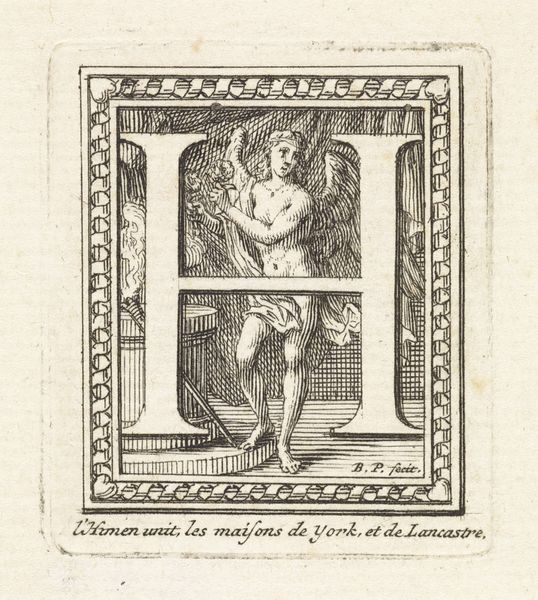
Editor: Here we have "Letter I en de huwelijksgod Hymen," or "Letter I and the God of Marriage Hymen," an engraving by Bernard Picart, dating between 1683 and 1733. I find the use of line so compelling, almost architectural in its precision. What compositional elements stand out to you? Curator: The "I" dominates the composition, doesn't it? Its stark whiteness creates a strong contrast against the intricate line work surrounding it. Notice how the artist uses the letter not just as a form, but as a structural element, dividing the scene and framing the figures of Hymen and what appears to be an allegorical figure of painting or creation. The linear quality certainly dictates a mood, but towards what? Editor: It's like the "I" becomes both barrier and bridge. It separates, yet also seems to connect the figures within the frame. Is there any balance in the space, though, given that large letter? Curator: Observe how Picart uses the lines themselves. The density varies, creating areas of light and shadow, which offers some volume but which in turn highlights that, no, there is actually little real balance here. Look at how Hymen's wings are rendered, versus the texture of the drapery, or the patterned frame. The composition relies heavily on these variations in texture and line weight. To consider, also, the implications of "Hymen" being connected with this stark representation; does that framing enhance, detract, or do something else entirely from the core ideas presented? Editor: That is true! I also missed how, in a way, the figure of Hymen leads into the letter I in shape. Looking closer, the frame is actually not equal in space and design either! I can’t unsee that now. Thanks for highlighting these details! Curator: My pleasure. Every line tells a story, doesn't it? Hopefully more than one!
Comments
No comments
Be the first to comment and join the conversation on the ultimate creative platform.