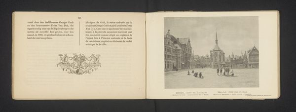
drawing, ink, pen
#
drawing
#
ink
#
pen
#
calligraphy
Copyright: Rijks Museum: Open Domain
Curator: There's an understated quality to this postcard, “Briefkaart aan Philip Zilcken,” likely created sometime between 1900 and 1924 by Octave Maus. Editor: Understated is right. The starkness, the casual ink strokes – it evokes a fleeting message, quickly penned and sent off into the world. I wonder, was it ever actually delivered? The postmarks are evocative symbols of their time... Curator: Exactly. Those postmarks—carefully placed graphic icons, aren't they? Each a deliberate marking of place and time, and layered meaning beyond a mere point of origin. This isn't just mail; it is a historical artifact now. The flowing calligraphy in ink... these choices signal so much about visual style in the early 20th century. Editor: How the politics of the day intersect. There's the stamp from Bruxelles dated December 24th, and the earlier stamps seem to indicate origins in Amsterdam. International exchange right there! Did the message on the card contain sensitive information, or even something subversive? Were such messages intercepted? And did it carry as much cultural weight back then as it seems to hold for us, examining it today? Curator: Perhaps. Consider that handwriting in this period carried its own significance. The hand was thought to express inner qualities. The formal, yet personal style speaks of cultivated exchange within a particular social circle. What does it tell us, do you think, about Maus sending this to Zilcken? It is just a quick hello from one colleague to another? Is it something more substantial? Editor: Precisely—what *is* it doing, culturally? That mix of familiarity, formality, and the faint ghosts of institutional frameworks. It becomes about reputation management, about presenting oneself, their friends and professional circles in a favorable light in the eyes of whoever might be examining that communication today. This "quick" missive is quite calculated. Curator: That gives me a different appreciation of its presence. Thank you. Editor: And I, similarly, value a better perspective. Seeing these stamps less as markers of mundane mail-handling and instead recognizing their rich iconography—that elevates the entire exercise.
Comments
No comments
Be the first to comment and join the conversation on the ultimate creative platform.
More like this