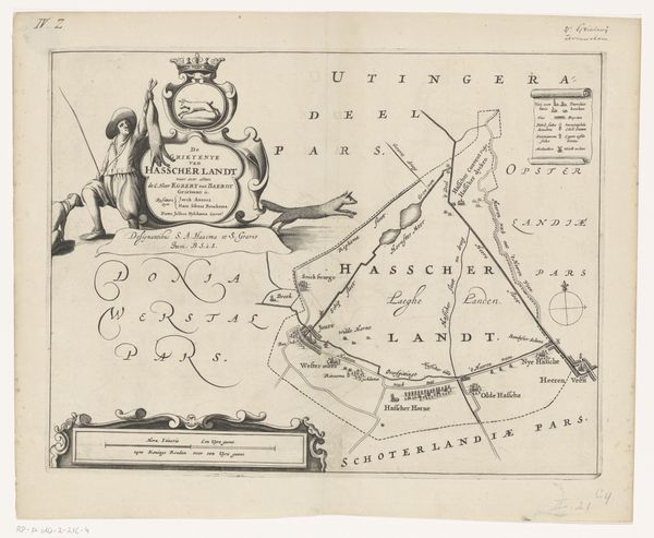
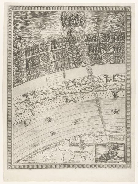
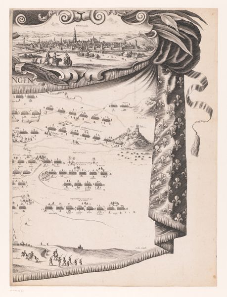
drawing, print, ink, engraving
#
drawing
#
baroque
# print
#
landscape
#
ink
#
engraving
Dimensions: height 762 mm, width 500 mm
Copyright: Rijks Museum: Open Domain
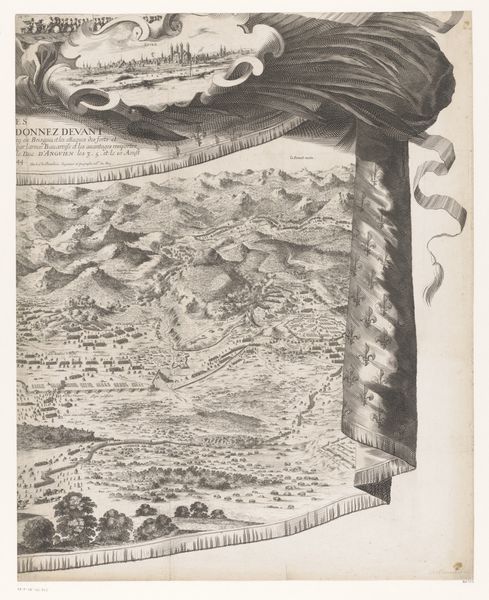
Curator: So, we're looking at "Kaart van de Slaperdijk (eerste deel)" – a map, really – by Caspar Specht, created way back in 1705. It’s currently held in the Rijksmuseum. Editor: This piece… I'm immediately struck by its delicate detail! The landscape and little heraldic crests woven together feel so… formal and considered. Given the style is Baroque, how should we consider its artistic intention? What do you see in this work that stands out? Curator: Ah, it's more than just a map; it’s a performance of power, darling! Maps in this period were assertions of control and knowledge. Look at the way Specht combines practical information with those rather elaborate crests. Doesn’t that remind you of something slightly… boastful? Almost like saying "We not only know this land, but we *own* it!” How does the prominence of landscape alongside heraldry play into this reading? Editor: You’re right. It’s like those crests are staking claims all over the territory! So, beyond just documenting, this map seems to have a really political undertone? I suppose, for me, it reframes the perspective… what I initially took as formal presentation, is really propaganda? Curator: Precisely. Now you're cooking! Consider the very name "Slaperdijk"— the Sleeping Dike. Even that is loaded; what's implied by a sleeping defensive structure, especially in a period of such rampant power struggles across Europe? It could suggest a confident feeling of impenetrable defense, or perhaps an unnerved fear? Editor: It really transforms the way I think about maps! From just navigational tools, to political statements. Curator: It's all about perspective, my dear. And sometimes, a touch of delicious Baroque arrogance makes for a richer viewing experience. Editor: Agreed. It definitely deepens the impression – makes the print more thought-provoking!
Comments
No comments
Be the first to comment and join the conversation on the ultimate creative platform.
More like this