print, woodcut, engraving
medieval
figuration
woodcut
northern-renaissance
engraving
Dimensions: height 217 mm, width 153 mm
Copyright: Rijks Museum: Open Domain
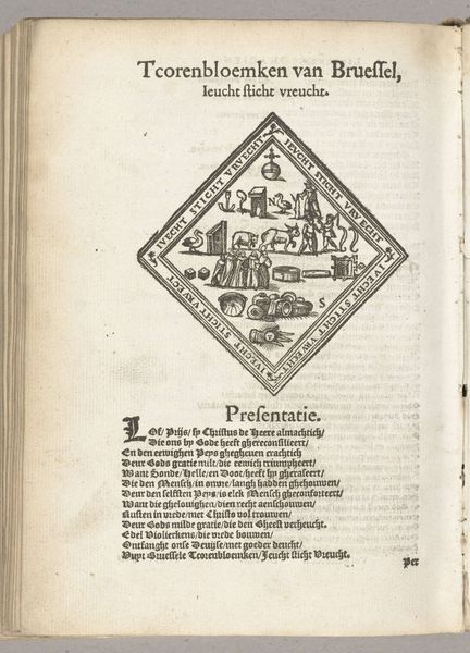
Curator: This image presents the 'Display of the Eyes of Christ (Diest), 1561.' It is an engraving and woodcut from the Northern Renaissance. I see the image embedded within a book page. Editor: Yes, the visual contrasts very starkly with the text block that accompanies it! It’s like two separate visual systems in dialogue with one another. What jumps out at you from this combination of printing methods? Curator: Notice how the anonymous artist has used the black lines to delineate forms with precision. The lozenge shape encloses the cross, plants, ribbons, and coats-of-arms, focusing our attention inwards and establishing compositional balance. We can examine this shape, both containing the primary symbolic forms of Christianity while contrasting against the looser lines of the printing block’s text. Editor: The rigid shape emphasizes those important iconographic motifs; is there something to the heraldry present that reflects it? Curator: Good eye. Heraldry was a status-laden language during the Renaissance, and the coats of arms may carry very local or personal references not currently decipherable. But focusing on its formal inclusion, its strategic placement is important to notice first: balancing in that top right and bottom left corners and thus strengthening the print’s borders and shape. I wonder, what does this do to one's viewing of it? Editor: Hmm…that contrast really intensifies the almost devotional feeling that it initially evoked. It frames and enhances this image in a similar way to medieval illuminated manuscripts that contrast very dramatically in their visual components. Curator: Precisely! Focusing our viewing upon that symbolic framing, this visual emphasis on shape makes us then turn to the symbolic relationships happening in the interior. And indeed, the inclusion of various heraldic signs reflects on status and power, further cementing the visual and historical components to that effect. Editor: Thank you, I now feel that I’ve considered those interior components in relation. This visual strategy that allows one form to frame another emphasizes that powerful interplay. Curator: And hopefully provided tools for future examinations into visual composition!
Comments
No comments
Be the first to comment and join the conversation on the ultimate creative platform.