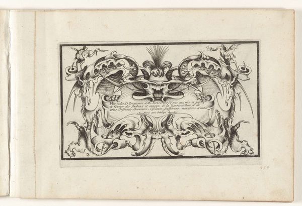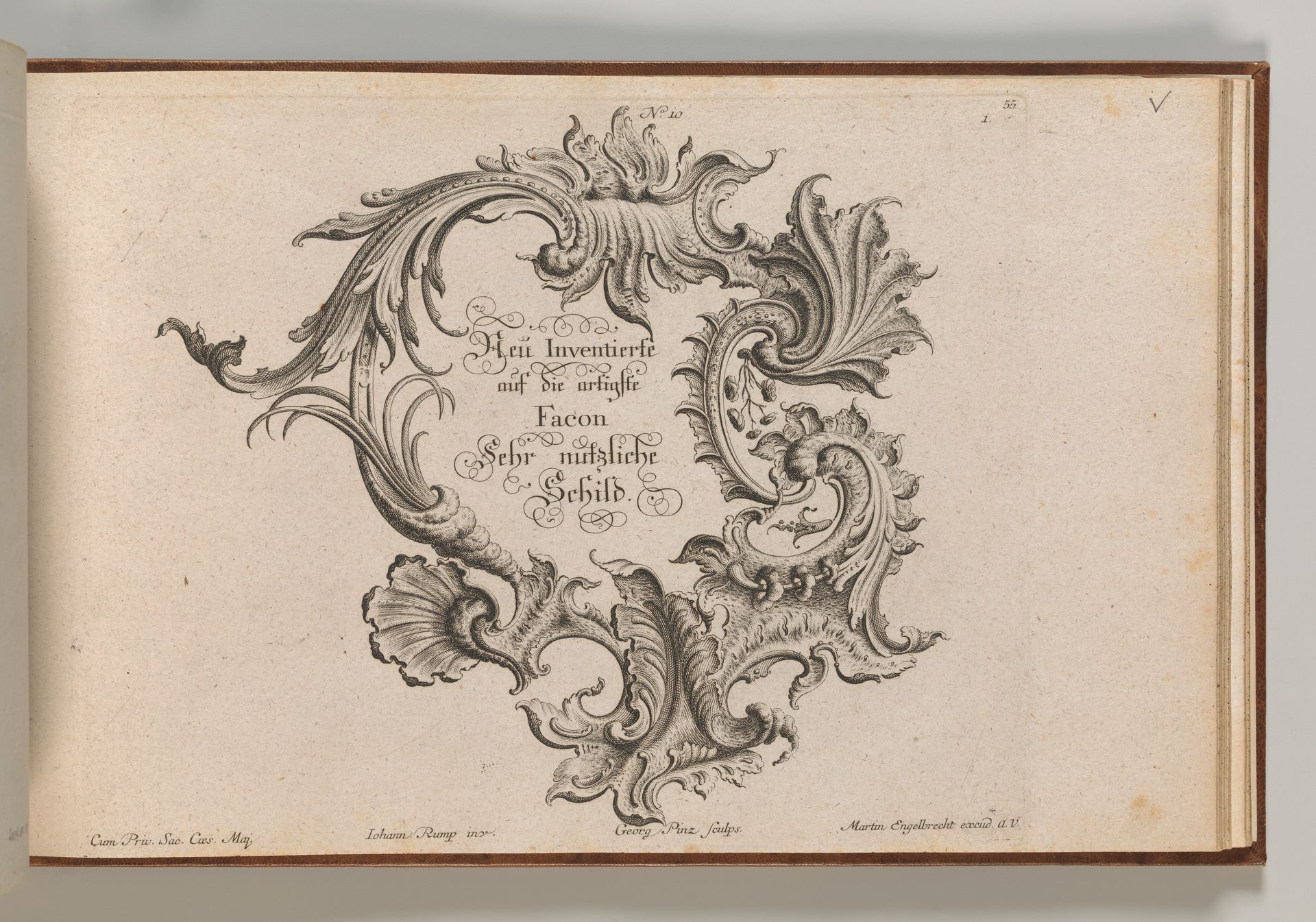
1745 - 1755
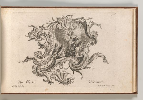
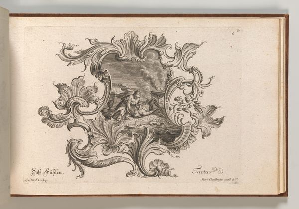
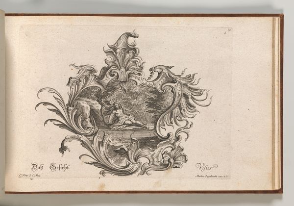
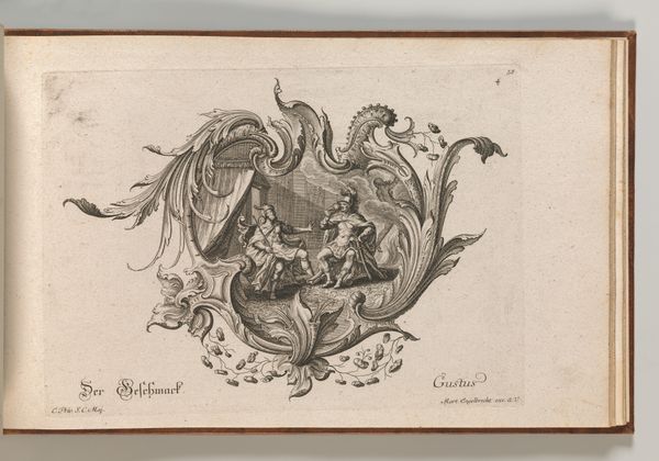
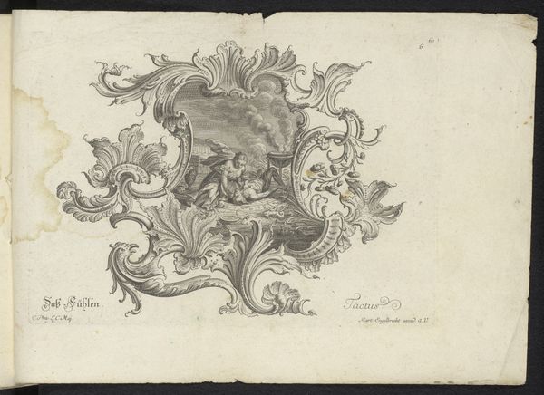
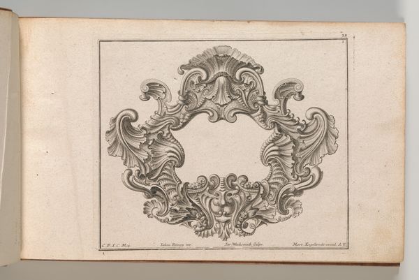
Design for a Cartouche, Plate 1 from 'Neu Inventierte auf die artigste Facon Sehr nutzliche Schild.'
Johann Georg Pintz
@johanngeorgpintzThe Metropolitan Museum of Art
Metropolitan Museum of Art, New York, NYListen to curator's interpretation
Curatorial notes
Curator: This engraving, titled "Design for a Cartouche, Plate 1 from 'Neu Inventierte auf die artigste Facon Sehr nutzliche Schild,'" comes to us from Johann Georg Pintz around the mid-18th century. I'm immediately drawn to its intricate linework; what’s your first impression? Editor: Ornate. Almost overwhelmingly so. There's a sense of robust energy and flourish, but the eye struggles to find a resting point within such an elaborate framework. Curator: Precisely. The density is key. This abundance of interwoven lines is a defining characteristic of the Baroque style. Note how the negative space is just as active as the delineated forms, creating a dynamic tension across the surface. Semiotically, this is ornament as language, pure and simple. Editor: Indeed. Cartouches often functioned as heraldic devices, frames for coats of arms, and emblems signifying power and lineage. In this context, I can't help but see these swirling vegetal forms and shell-like motifs as expressions of earthly abundance and a connection to the natural world—cornerstones of wealth and status at the time. The image itself creates an invitation of a visual narrative for those it framed. Curator: Yes, they offered that visual invitation through controlled displays. Observe how the line quality varies; areas of deep, dark engraving contrast with lighter, more delicate hatching. It's a masterful use of texture to define form and spatial depth on a essentially two-dimensional plane. Consider also how this was printed; the materiality of the engraving on the paper affects our interpretation. Editor: Absolutely. And thinking of it as a container, what the cartouche holds – name, symbols, aspirations - becomes incredibly potent. This cartouche's almost animalistic curves signal raw, untamed, yet refined natural forces; think of it as nature disciplined into a visual language of social mobility and the associated desires of the time. Curator: An intriguing reading. Focusing again on purely formal elements, observe how the composition is asymmetrical, eschewing classical balance in favor of a more dynamic, visually stimulating arrangement that captures your focus, if even somewhat discordantly. Editor: This engraving serves as a great reminder that symbols are powerful visual echoes across time, each tailored to the era from which it emerged and shaped by the artist that delivers them. Curator: Indeed, Pintz allows us to deeply understand, analyze, and deconstruct, these artistic modes of representations of a certain time.