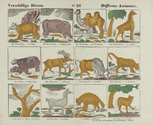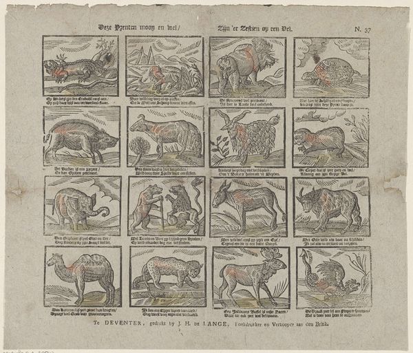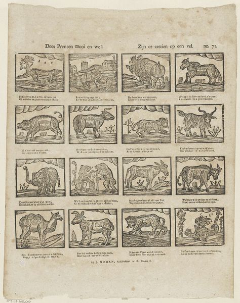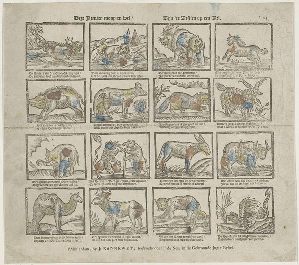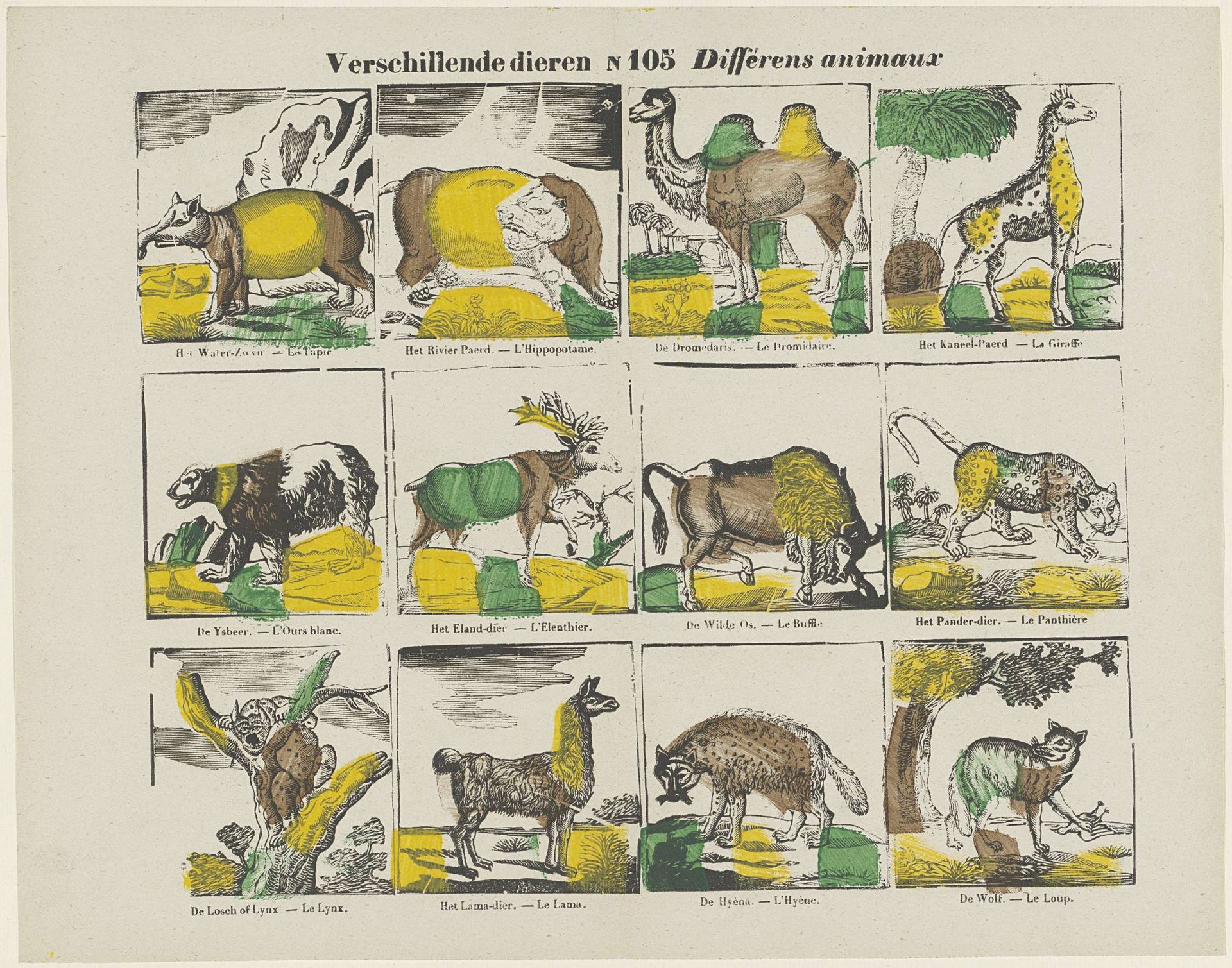
1856 - 1900
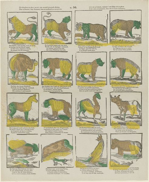
Verschillende dieren / Différens animaux
Listen to curator's interpretation
Curatorial notes
Curator: This print, "Verschillende dieren / Différens animaux" by Glenisson & Zonen, likely dates between 1856 and 1900. It appears to be an etching, perhaps intended as a study aid or an early form of visual learning tool. I am intrigued by the simplistic way the natural world is composed here. Editor: It feels like a quirky, proto-scientific illustration, doesn’t it? The use of block colors is so odd. How do you interpret the arrangement of these animals, all presented in these artificial boxes? Curator: The arrangement, segmented as it is, invites a structural analysis. Consider each animal within its bounded square: what is prioritized? Observe the stark outlines and the limited, almost arbitrary color palette. Are they emphasizing a superficial categorization? The visual choices downplay naturalism in favor of… what? Perhaps symbolic representation through color. Editor: So you’re saying the colors and borders aren't about representing the actual animals, but about communicating something else? Could the animals themselves be seen as signs within a larger structure? Curator: Precisely. We might consider a semiotic reading, investigating what systems of meaning are being employed. The juxtaposition of seemingly disparate creatures—bear, camel, lynx—invites a taxonomy, not necessarily biological, but potentially linguistic or even moral. Are these boxes serving as discrete linguistic units within a broader visual language? Editor: That's a fascinating perspective! I initially saw it as a simple, slightly clumsy illustration, but the focus on structure makes me see it as more deliberate and complex. I see now it opens a window onto representational strategies that rely less on direct observation and more on conceptual order. Curator: Indeed. The piece reveals how form itself communicates, quite apart from any representational accuracy. By foregoing surface realism, it reveals something deeper about the artifice of classification.