Dimensions: Width: 2 3/8 in. (6.1 cm) Length: 3 9/16 in. (9 cm)
Copyright: Public Domain
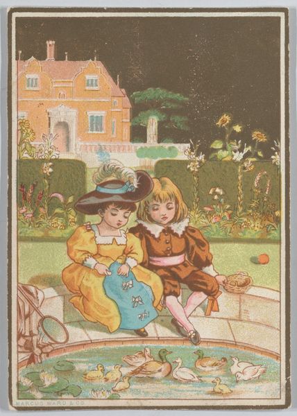
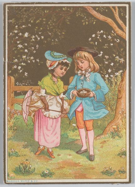
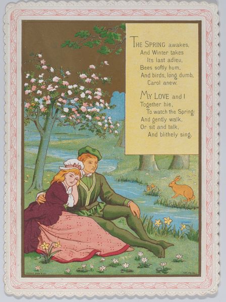
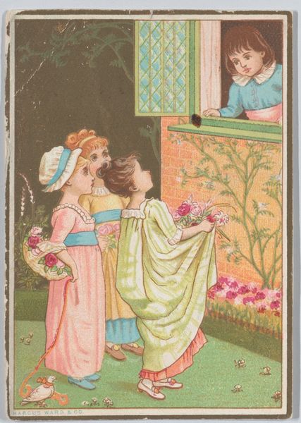
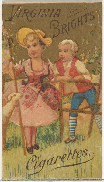
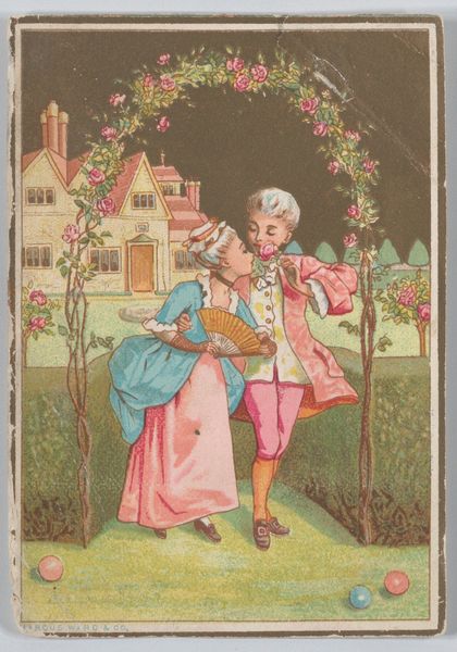
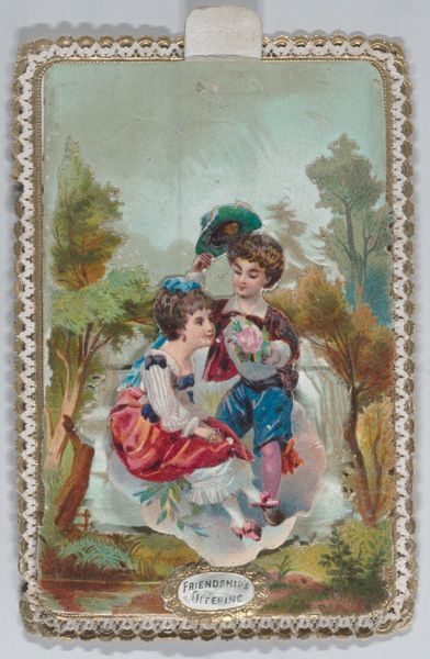
Editor: Here we have Kate Greenaway’s "Valentine," a color print made with watercolor and colored pencil from 1876. The piece evokes a gentle, almost dreamlike quality with its muted colors and idyllic scene. I'm curious, what formal elements strike you most in this artwork? Curator: The deliberate organization of forms commands attention. Observe how Greenaway employs a limited palette, predominantly soft pinks, greens, and browns. Note the textural variation; the smooth skin of the children contrasts sharply with the woolly texture of the lamb, a study in contrasts that engages the eye and asks us to question its semiotic purpose. Editor: The texture play is interesting, creating emphasis with simple coloring techniques. How do you feel that balance works, considering this might be categorized as "naive art"? Curator: Indeed, the term 'naive' might imply a lack of sophistication, but it's the carefully calibrated simplicity that is compelling. The spatial arrangement, with the figures clustered centrally, achieves balance, enhanced through carefully implemented symmetries in form. Editor: It seems every element contributes to the emotional weight of the work, adding a richness beyond the initial appearance. Thanks for the fresh eyes! Curator: Likewise; examining how individual forms function strengthens an artwork’s appeal. The dialogue has enriched the original impact of the visual details.
Comments
No comments
Be the first to comment and join the conversation on the ultimate creative platform.
 Collect
 React
React Comment
More like this