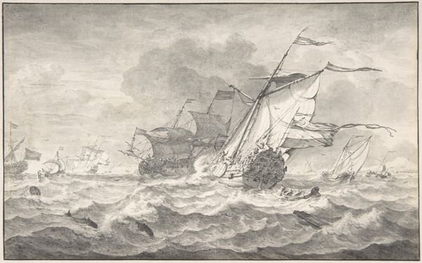
print, engraving
#
baroque
#
dutch-golden-age
# print
#
landscape
#
engraving
Dimensions: height 150 mm, width 197 mm
Copyright: Rijks Museum: Open Domain
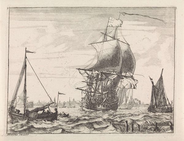
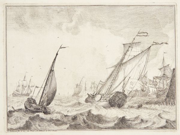
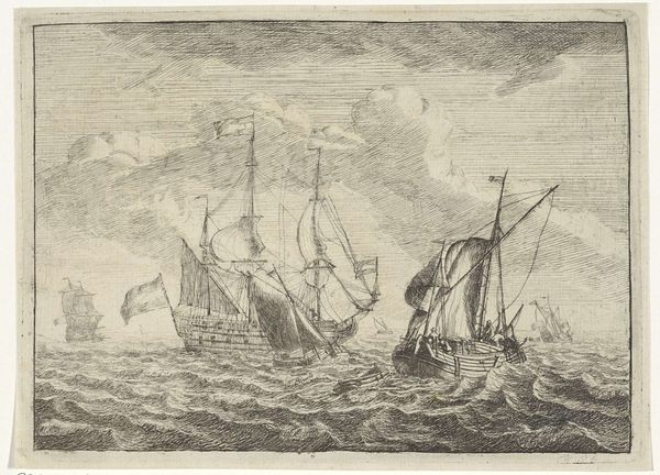
Editor: Here we have "Ships at Sea," a print made between 1717 and 1770, credited to Frederik Ottens. The material is engraving. It has a dramatic feel. How do you interpret this work through its formal elements? Curator: This engraving demonstrates a masterful use of line and texture to create depth and dynamism. Note how the density of the lines in the foreground builds up to represent the roiling waves, giving way to the sky. Editor: Yes, the contrast is really striking. How do you think the composition contributes to the overall meaning? Curator: The diagonal thrust of the ships—their sails billowing—creates a sense of imbalance and precariousness. Observe the Baroque’s typical employment of diagonal compositions for dynamism, diverging from a strict Renaissance grid or earlier traditions that favor balance. This deviation itself signifies an active intervention. What is its consequence? Editor: Perhaps a feeling of man versus nature. Like the ships are struggling against the ocean's power. Curator: Precisely! The materiality of the engraving – the very lines etched into the plate – contribute to the image's powerful contrasts. Do you find these details essential? Editor: Absolutely. Considering the limitations of the medium, the artist really maximizes tonal range. Curator: Agreed. By attending to the structure, materiality, and line quality of this engraving, we understand its visual and expressive intent more profoundly. Editor: I see what you mean! Thanks for pointing out these elements; it has shaped how I appreciate it now. Curator: My pleasure. Close attention always reveals an active exchange embedded within these objects.
Comments
No comments
Be the first to comment and join the conversation on the ultimate creative platform.
More like this