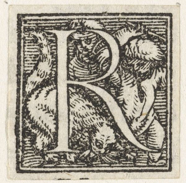
Letter R c. 16th century
Copyright: CC0 1.0
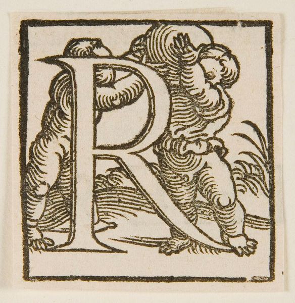
Editor: Here we have the block print "Letter R," author unknown. It's quite fascinating! The letter itself is intertwined with a horse, a man, and even what looks like a dragon. What strikes you about the composition? Curator: The interplay of line and form is compelling. Notice how the artist uses hatching and cross-hatching to create depth and texture. The letter R serves as both a structural element and a frame for the narrative scene. The linear quality is also notable; how do you interpret the spatial arrangement? Editor: It feels a bit crowded, almost chaotic, but the R provides a sense of order. I wonder if the artist was making a statement about the relationship between language and nature. Curator: Perhaps. Or it could simply be a decorative element, emphasizing the aesthetic qualities of the letterform. The balance and interplay are all part of a system that conveys meaning on more than just a literal level. I’ve not quite put my finger on it yet, what about you? Editor: I never thought about it that way! It's amazing how much can be conveyed through line and form alone. Curator: Indeed. The beauty of art lies in its ability to evoke multiple interpretations.
Comments
No comments
Be the first to comment and join the conversation on the ultimate creative platform.
More like this