Copyright: CC0 1.0
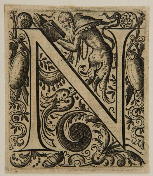
Editor: Here we have a fascinating, undated piece from an anonymous artist, titled "Letter N", at the Harvard Art Museums. I’m struck by the intricate detail within such a constrained space; it feels almost medieval. What stands out to you? Curator: The density of line is remarkable. Observe how the artist uses only variations in line weight and proximity to create depth and texture. Note how the 'N' itself acts as a structural armature for the fantastical figures and foliage. Editor: So, the letterform isn't merely a letter, but also a framework? Curator: Precisely. The success of the work lies in the symbiotic relationship between the graphic clarity of the 'N' and the ornate details it contains. The visual tension creates a dynamic whole. Editor: I see. The stark contrast between black and white further emphasizes the graphic quality, creating a harmonious yet stimulating effect. Curator: Indeed, it’s a testament to the power of formal elements in creating a compelling visual experience.
Comments
No comments
Be the first to comment and join the conversation on the ultimate creative platform.
More like this