#
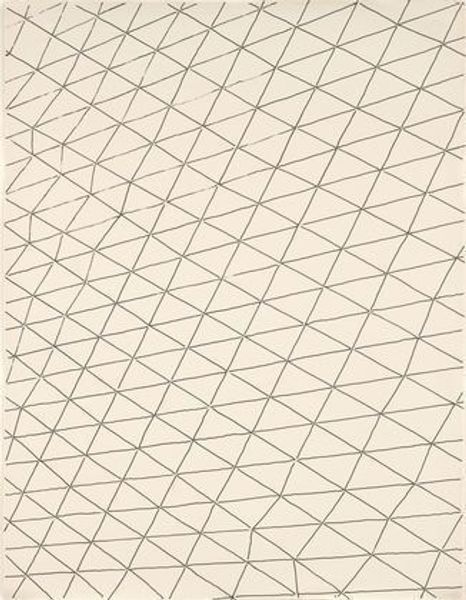
op-art
#
conceptual-art
#
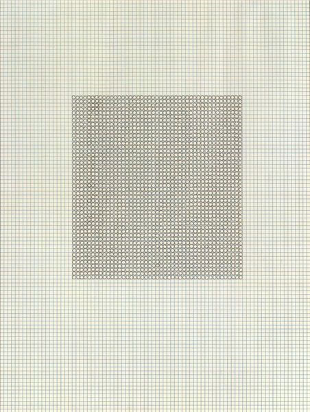
minimalism
#
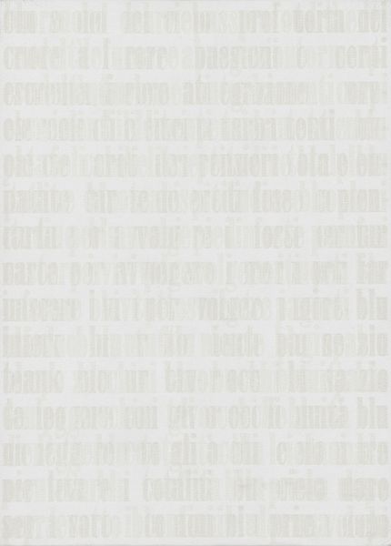
typeface
#
pattern
#
op art
#
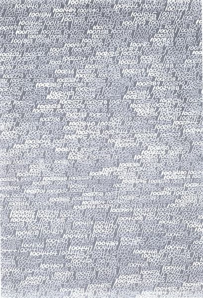
text art
#
bold font
#
text
#
typeface variation
#
text type
#
geometric
#
abstraction
#
line
#
regular font
#
varying line stroke
#
white font
#
sans serif type
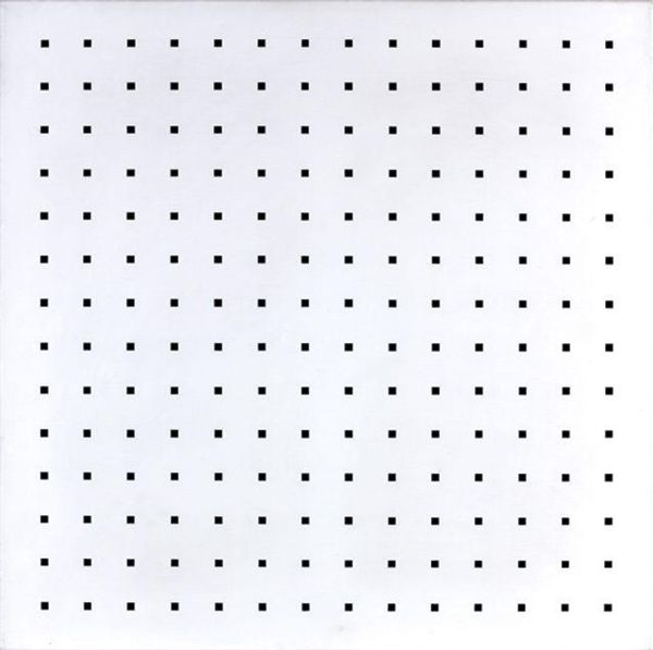
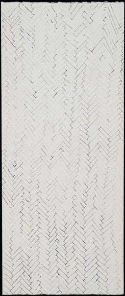
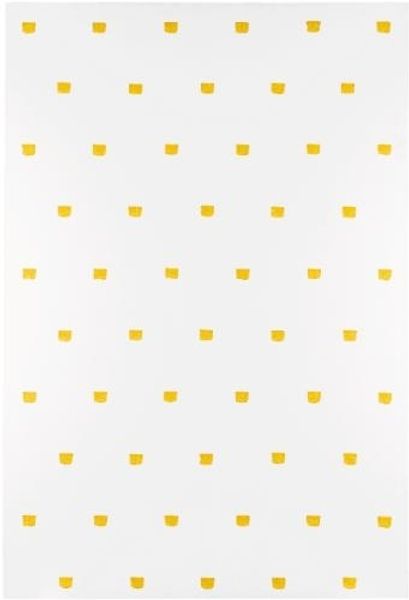
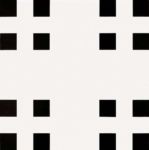
Copyright: Francois Morellet,Fair Use
Francois Morellet made this artwork, Every 15 cms, every 16 cms (dash of one cm long), using simple marks to create something quite complex. You know, it’s almost mathematical. Like following a recipe, where the outcome is somehow both predictable and surprising. I’m drawn to the texture of the dashes. They’re not perfect. Each one has its own little wobble. Some are darker, some lighter. It makes me think about how we try to control things, especially in artmaking. Like, you set out with a plan, but the material itself, the paint, the brush, even your own hand, has its say. Look closely and you’ll see what I mean. This piece, it's all about the conversation between the idea and the execution, the rule and the break from it. It reminds me a bit of Sol LeWitt, but with a quirkier edge. It’s not about perfection; it’s about the beauty in the system, and the slight imperfections that make it human. A reminder that art, like life, is an experiment.
Comments
No comments
Be the first to comment and join the conversation on the ultimate creative platform.
More like this