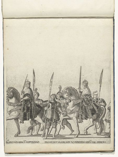
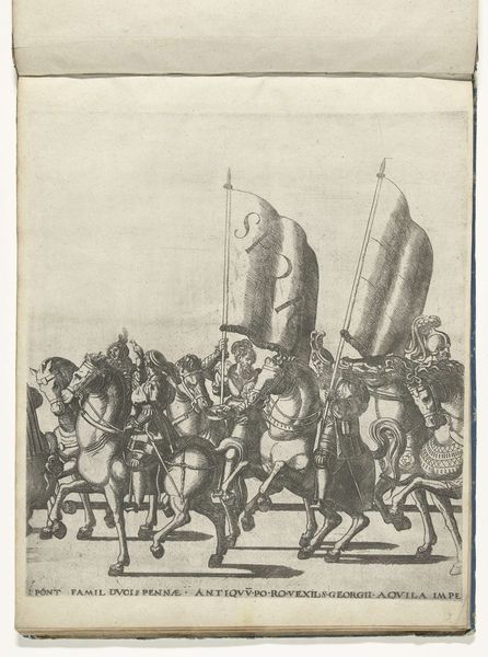
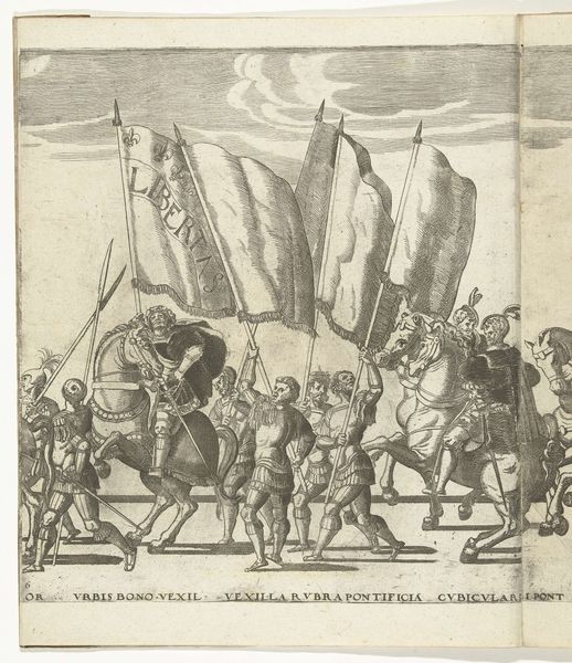
Filips, paltsgraaf en hertog van Beieren, met de rijksappel en Karel III, hertog van Savoye, met de keizerskroon, plaat 25 Possibly 1530 - 1620
drawing, print, ink, engraving
portrait
drawing
pen sketch
pencil sketch
11_renaissance
ink
ink drawing experimentation
history-painting
engraving
Dimensions: height 330 mm, width 300 mm
Copyright: Rijks Museum: Open Domain
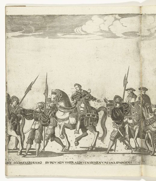
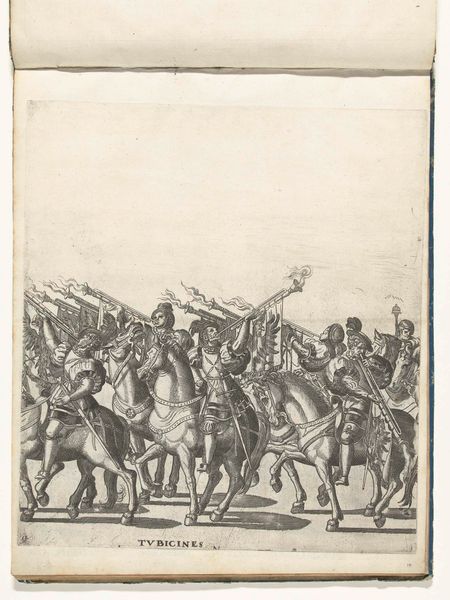
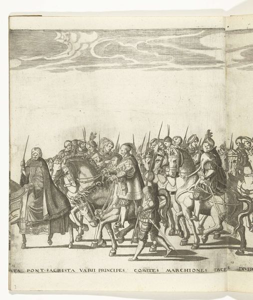
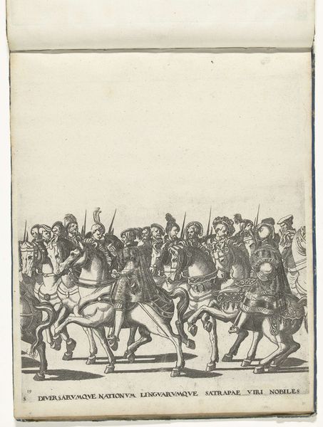
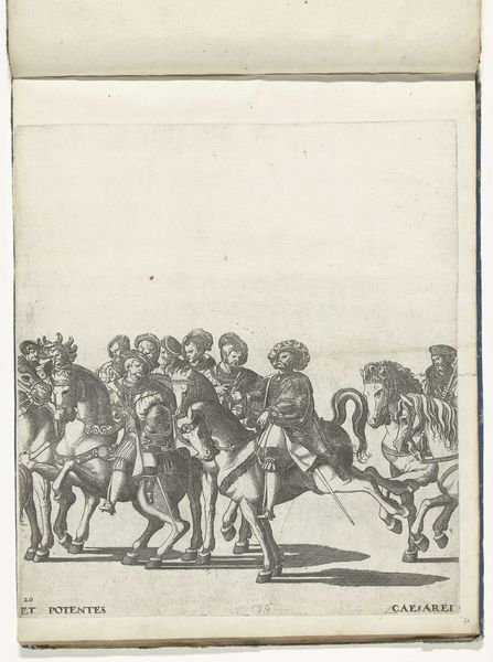
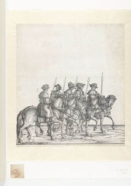
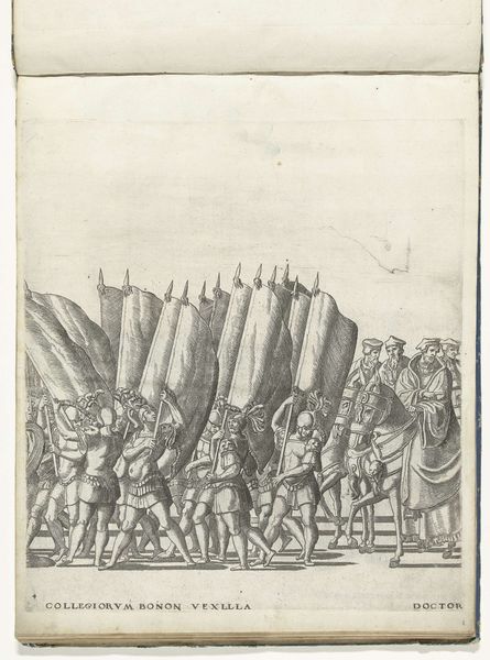
Editor: This is "Filips, paltsgraaf en hertog van Beieren, met de rijksappel en Karel III, hertog van Savoye, met de keizerskroon, plaat 25" by Nicolaas Hogenberg, made sometime between 1530 and 1620. It looks like an ink and engraving print. The composition with these figures on horseback makes it seem like a procession of power. How do you interpret this work, focusing on its formal qualities? Curator: The most compelling aspect of this engraving is its graphic quality. Notice the meticulous application of hatching and cross-hatching. Hogenberg has clearly devoted himself to creating tonal variation using only line work. Observe the distinct textures rendered, differentiating fabric, skin, and even horsehair. Editor: The linework really does define the shapes and textures. It’s amazing how much detail is conveyed with just simple hatching and cross-hatching! What purpose do you think it serves in this composition? Curator: Semiotically, the lines serve as both signifiers of form and as formal devices creating visual interest. The controlled chaos of interwoven lines creates contrast with the plain background. Now, consider the artist's choice to depict the figures in profile rather than frontally, what effect might that have on the overall reading of the work? Editor: Hmm, perhaps to suggest a specific order or direction of power. Also, focusing on purely the formal aspects, the overlapping figures create a sense of depth despite being a mostly linear artwork. Curator: Precisely! And further consider the spatial arrangement of the figures relative to one another, what do these relations indicate formally? Editor: I guess this arrangement flattens the perspective, but perhaps that gives it a more ceremonial feeling as they are linked together by visual connections that are flattened but distinct! Thanks for pointing that out. I definitely see it differently now. Curator: Indeed. It is through the rigorous analysis of line, form, and spatial relationships that we are better able to perceive Hogenberg's purpose here.
Comments
No comments
Be the first to comment and join the conversation on the ultimate creative platform.