Curatorial notes
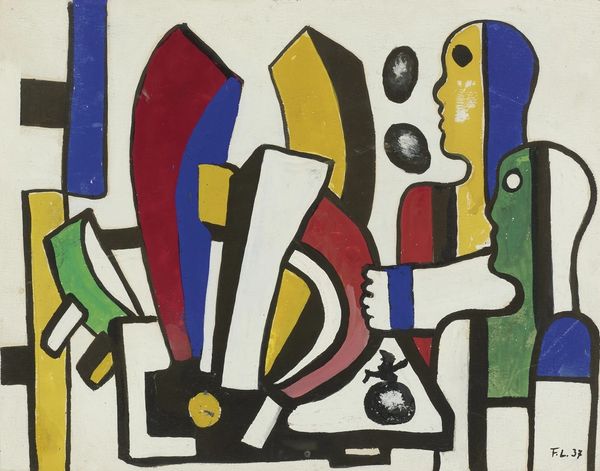
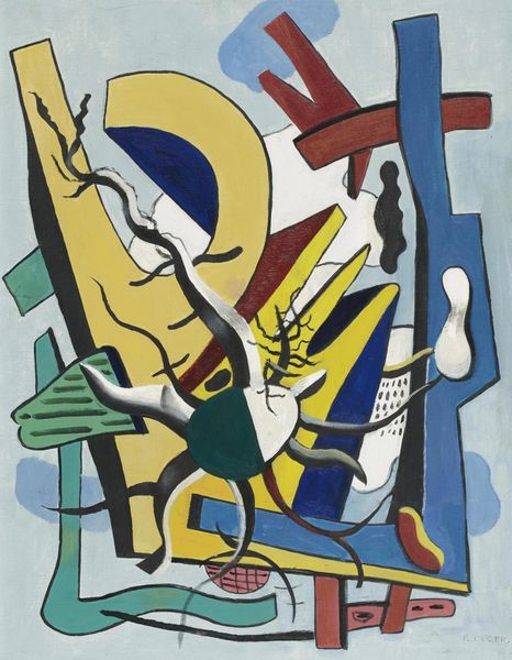
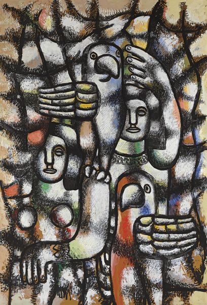
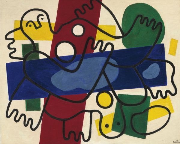
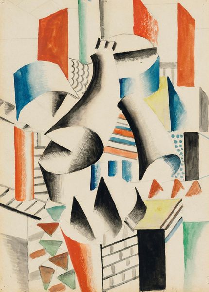
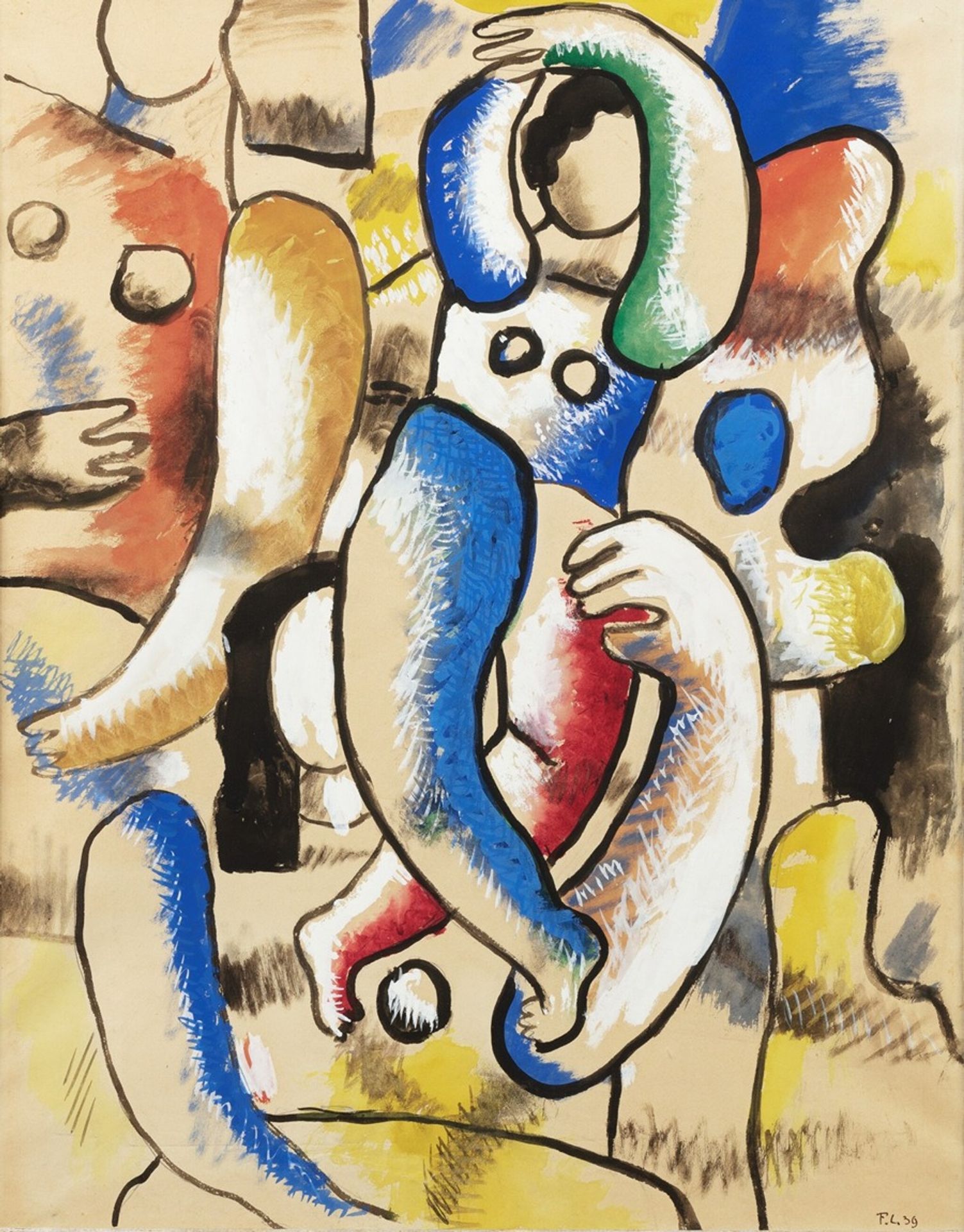
Curator: I find myself really drawn into this vibrant watercolor by Fernand Léger. Created in 1939, it's entitled "Femmes," or "Women." Editor: My first thought? Joyful, chaotic. It almost feels like the figures are puzzle pieces that don't quite fit. The colors pop, but there's something slightly unsettling about the composition. Curator: It’s Léger exploring the figure within the context of early modernism, but as the shadow of the second World war begins to loom, we see those unsettling qualities emerging. The overlapping forms and simplified shapes do give it a fractured feel. Do you see references to earlier Cubist ideas of simultaneity? Editor: Absolutely, it's reminiscent of Cubism but with its own flavor. I notice how the bold black outlines, even harsh in places, define the shapes and give the figures presence, but also compartmentalize them, flattening perspective. Perhaps it reflects the way conflict disrupts harmonious existence. It feels quite stylized, and I can’t help wondering if some references are personal to him? Curator: It's certainly tempting to read biographical symbolism into his works, but Léger was very interested in creating art that spoke to the masses, almost like industrial design in that regard. Think of those vibrant colors, the bold lines and shapes—he embraced modernity. These were meant to be archetypes of universal experiences, so he tried to reduce them to basic parts that resonated with the public. Editor: Yes, those shapes certainly evoke universality, a sense of primal forms but somehow, still very intimate, especially when focusing on the subjects’ arms. Look at the hands in particular! They almost create a feeling of embraces within all that chaos. What are your feelings on its use of line? It stands out to me for how simple yet effective it is at communicating shape, form and volume within this image, don't you think? Curator: Very much so. And seeing it through this context adds yet another layer. The seemingly disparate parts come together in a surprisingly effective emotional portrayal—the bold style providing order while simultaneously feeling frenetic. It really draws you in and allows multiple interpretations. Editor: I agree. And perhaps that tension is what makes it so engaging and, dare I say, timeless. Thanks, I appreciate your historical context to really understand its intent and design, too.
