glasgow-school
Copyright: Public domain
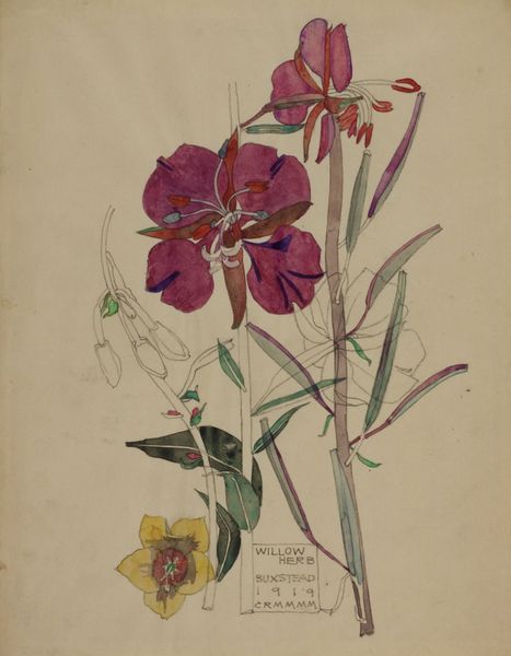
Curator: Here we have "Petunia, Walberswick," a piece from 1914 by Charles Rennie Mackintosh. He worked in both watercolor and colored pencil here to bring these flowers to life. Editor: Well, first impressions? It feels so delicately wistful. Those barely-there washes of color, the unfinished edges…it’s like a memory of summer clinging to the page. Curator: Absolutely. I see a conscious rendering of the ephemeral nature of beauty. But it’s more than just pretty. Mackintosh was deeply engaged in the Arts and Crafts movement, which saw a return to handmade crafts in a period when manufacturing was becoming dominant. And there’s a handmade, even homespun quality to this image. Editor: Definitely. You can almost smell the paper and the pigments. This piece feels like an experiment in materials and form rather than a botanically accurate portrayal. I mean, look at how he's outlined shapes, leaving areas untouched by paint—he's deliberately showing us his method. Curator: It is intriguing. Those outlines suggest the influence of Japanese art, don’t you think? The simplification of form, the emphasis on line... It all resonates with the aesthetic principles Mackintosh embraced. He often moved between his architectural design work and these quieter, more personal pieces. It’s like he needed the control and the order of the architectural drawings, and then he needed this…freedom. Editor: And thinking about the material realities of the time, with industrialization booming, this sort of hand-crafted image takes on a different weight. It resists the mechanization of beauty, advocating for a slower, more intimate approach to seeing and creating. It's quietly political, I think. Curator: Perhaps he sought a balance between industry and nature; in those trying times I am sure these were more intertwined than we might imagine. What do you make of his colour choices, if I can ask? I see, I think, not simple reality but carefully placed emotional connections in his pigment selection. Editor: They're interesting, aren't they? The vivid purple contrasted with that faded, almost ghostly pink... It lends the piece a sort of bittersweet harmony, and there's that interplay between boldness and reserve to be certain. Curator: For me it really is that dance between presence and absence—bold color and sketched form—that makes it stay in your mind after you have seen it. A very memorable garden, frozen for a brief eternity. Editor: Indeed. A testament to the power of the hand, the eye, and a thoughtful approach to materials in a world increasingly dominated by machines.
Comments
No comments
Be the first to comment and join the conversation on the ultimate creative platform.