Dimensions: height 213 mm, width 321 mm
Copyright: Rijks Museum: Open Domain
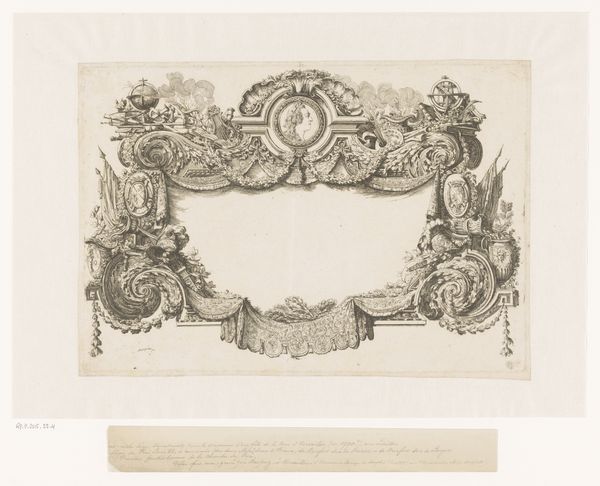
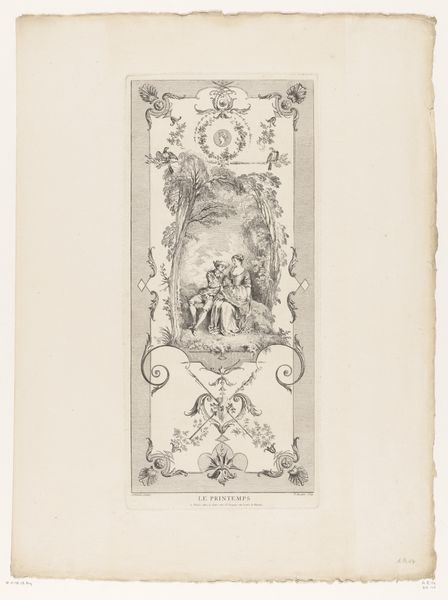
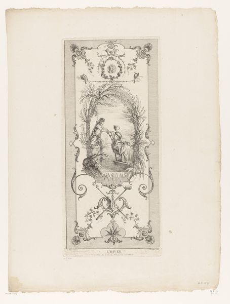
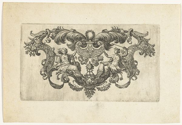
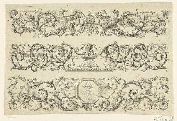
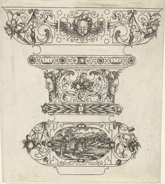
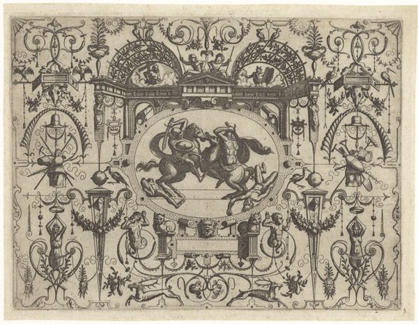
Curator: This is "Ornamentele omlijstingen en cartouche", which translates to something like "Ornaments, Frames, and Cartouches." It's an ink and pen drawing by Heinrich Hugo Coentgen, made sometime before 1785. Editor: Intricate, isn't it? Like a frosty breath on a windowpane, or some elaborate cake decoration. I feel like I'm peering into the past, into a world where detail and flourish reigned supreme. It's intensely... fussy, yet fascinating. Curator: Fussy, yes, and very much of its time. These kinds of ornamental designs were incredibly popular. Coentgen, as an engraver, was catering to a demand for decorative elements that could be adapted for all sorts of things, from furniture to architecture. Editor: So, it's almost like a page of clip art from the Baroque era? A stencil for the ambitious craftsman. I like how these cartouches—these little framed areas—float amidst the swirling vegetal forms. Did each of these serve a specific purpose? Curator: In principle, yes. The central cartouche is meant to hold text, probably an inscription or a coat of arms. The surrounding ornament would then amplify the importance, adding to the overall message. Think of it as visual rhetoric. Editor: Visual rhetoric! I love that. But there's a tension here, isn’t there? All the details fight for attention. The eye doesn’t know where to land. Is this design meant to highlight or obscure? Curator: Good question. The goal was to impress, not necessarily to clarify. Baroque art often aimed for emotional impact, to awe the viewer with complexity and grandeur. Editor: It certainly awes! I'm amazed by the sheer amount of work that went into this drawing. You can almost feel the pressure of the artist's hand, slowly, carefully coaxing these ornate details into existence. What do you think about its social context, it is clearly some sort of luxury item for the wealthy. Curator: This drawing offers us insights into 18th-century material culture and artistic training, it reminds us how interconnected artistic vision and social power actually are. Ornament, then, was never neutral, always active in its cultural work. Editor: I like the way this artwork challenges our contemporary ideas about minimalism and utility. Now, I see even in a seemingly "simple" ornament there's a complex web of ideas, values, and human effort intertwined. Curator: Exactly! The object is also speaking to something bigger, it teaches something. Thanks for the illuminating comments. Editor: My pleasure. It certainly made me think about how taste is always embedded within larger social forces.
Comments
No comments
Be the first to comment and join the conversation on the ultimate creative platform.