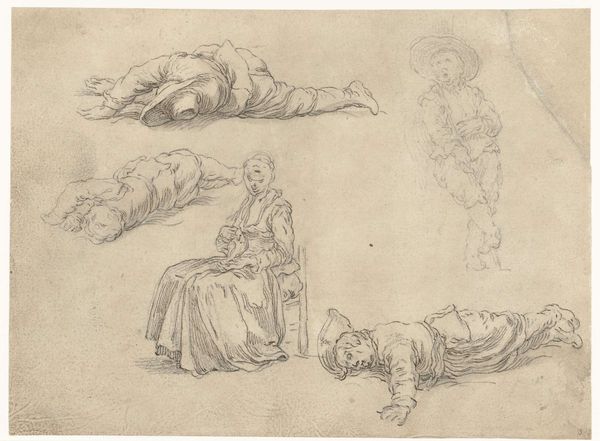
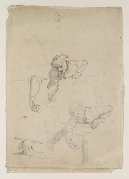
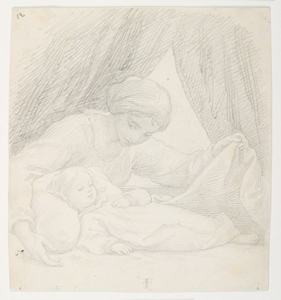
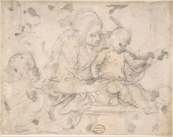
Studie voor de figuur van Maria in de Geboorte in het Prado, Madrid, en twee studie van een slapend Christuskind c. 1597
0:00
0:00
federicobarocci
Rijksmuseum
drawing, pencil
#
portrait
#
drawing
#
figuration
#
11_renaissance
#
pencil
#
history-painting
#
italian-renaissance
Dimensions: height 273 mm, width 216 mm
Copyright: Rijks Museum: Open Domain
Editor: We're looking at "Study for the figure of Mary in the Nativity in the Prado, Madrid, and two studies of a sleeping Christ Child" by Federico Barocci, dating from around 1597. It's a pencil drawing. It feels unfinished, almost dreamlike. I'm curious – what elements of composition stand out to you most prominently? Curator: Note first how Barocci contrasts the delicate lines forming the figure of Mary with the heavier shading used for the sleeping Christ Child figures. Consider also how the negative space around each grouping isolates them, emphasizing each form as an independent study. Can you observe any connection across these elements? Editor: Well, I see the way Mary’s gaze is directed downwards, seemingly toward where the Christ Child would eventually be positioned in the final painting, creating a visual link between them despite their physical separation in this sketch. Curator: Precisely. And what of the texture created by the layering of lines? Barocci isn’t merely defining shapes; he’s building form through density of mark-making. Note how in some instances, we see what seems to be red chalk augmenting a study in pencil, yielding an interesting study of combined media within one unified work of art. How does this interplay with light? Editor: The varied pressure of the pencil creates highlights and shadows, especially noticeable on Mary’s drapery and the infants' limbs, lending a sense of three-dimensionality despite the flat surface. So he’s exploring volume and light in preparation for the larger painting, I imagine. Curator: Indeed. It's the syntax of light and form, constructed through line, that animates this composition. Considering his strategic use of negative space and controlled execution of pencil strokes, what is left, and what does it suggest? Editor: This has been a fascinating deconstruction! Seeing how Barocci builds form through such deliberate mark-making and contrasting techniques provides a richer understanding beyond just the subject matter. Curator: Yes, a vital skill that any good editor must practice, even now.
Comments
No comments
Be the first to comment and join the conversation on the ultimate creative platform.
More like this