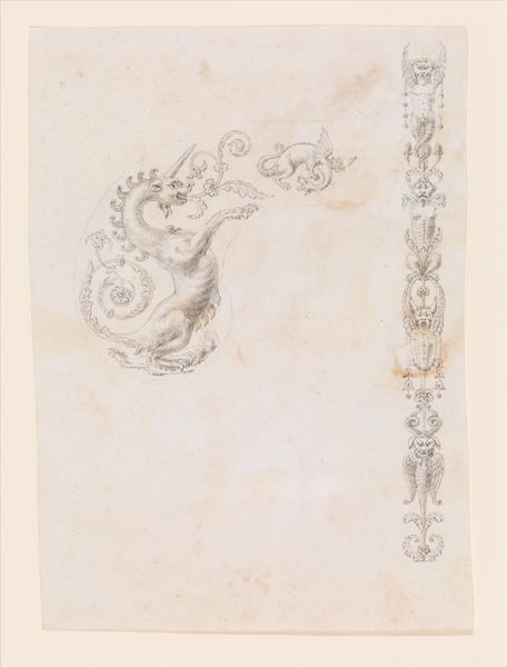
drawing, print, paper, watercolor, ink, chalk, black-chalk
#
drawing
#
baroque
# print
#
paper
#
watercolor
#
ink
#
chalk
#
watercolour illustration
#
history-painting
#
black-chalk
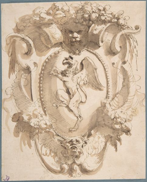
Dimensions: 405 × 580 mm
Copyright: Public Domain
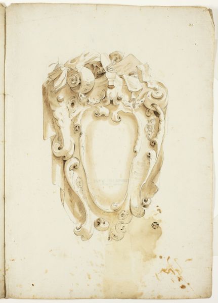
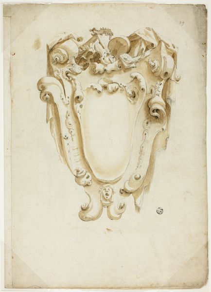
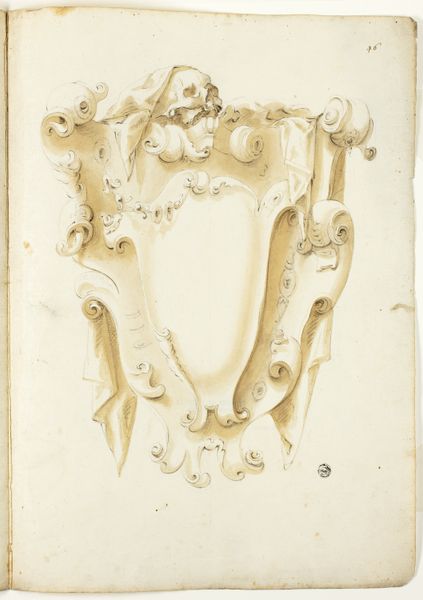
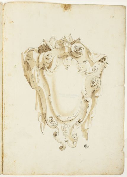
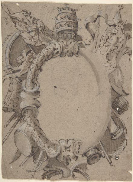
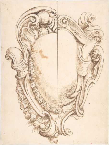
Curator: Before us is an intriguing study titled "Design for Ecclesiastical Escutcheon," its creator remaining anonymous. Rendered in ink, watercolor, and chalk on paper, it gives us insight into the baroque period. What's your first reaction? Editor: The sweeping curves and dense ornamentation strike me first. It's visually heavy, but also has a sort of graceful flow, directing my gaze upwards towards the heraldic elements. The restrained palette contributes to its solemn mood. Curator: Agreed. Notice how the materials and techniques available at the time dictated the forms? Chalk for initial sketches, then ink for outlining, watercolor to achieve depth. These processes would be accessible within a workshop setting where this kind of artwork might be crafted. Editor: Indeed, the visible chalk underdrawing gives a peek into its making, exposing a layering technique—revealing the artist’s working methodology from initial draft to a more finished rendering. Curator: Exactly. The visual language screams power and authority—the miter and crozier prominently displayed signal papal authority. The artist is consciously employing a visual rhetoric here to convey this. It probably served as a preparatory study, a blueprint really. Editor: The composition really leans on classical symmetry and hierarchy, even as the flourishes around it feel very expressive. Note the use of texture through varied strokes. It seems as though they have been meticulously deployed to catch light. It almost wants to pop out. Curator: And don't forget the paper itself! Sourcing that would have been a process itself involving skilled laborers. And thinking about where this design would finally reside informs its reading too. An ecclesiastical institution as a site of production is pretty interesting in itself. Editor: Looking closer, there is also the texture and weight inherent to the chosen mediums. It invites a kind of tactile imagination where one envisions the work in three dimensions—translating it from design into a constructed piece with tangible impact. Curator: Analyzing this work exposes just how integrated art production and craft practices are with specific religious powers, right? We are drawn to question what materials meant to various sections of society at the time, versus their meaning today. Editor: I like that focus, and for me, thinking about this artwork reveals a kind of tension inherent in these displays of power—how they aimed for the sublime and yet also, when scrutinized through the language of form, texture and symbol reveal the means by which they exert that authority. It is thought provoking.
Comments
No comments
Be the first to comment and join the conversation on the ultimate creative platform.
More like this