graphic-art, print, poster
#
graphic-art
#
art-nouveau
# print
#
decorative-art
#
poster
Copyright: Public Domain: Artvee
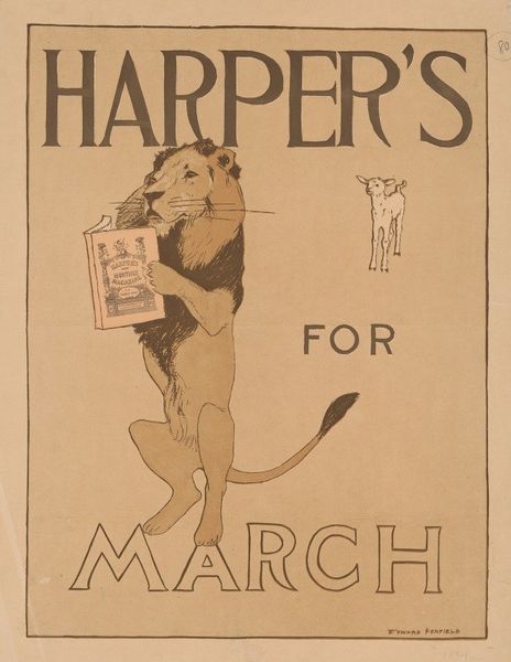
Editor: This is Edward Penfield’s “Harper’s for July,” a poster from 1892. It really evokes a sense of old-fashioned Americana to me, especially with those red, white, and blue ribbons. What stands out to you? Curator: The visual interplay is quite deliberate. Consider how Penfield has arranged the elements. The title is framed within a dark, ornate cartouche, providing a visual anchor at the top. Your eye then follows the curved ribbons, echoing the shape above and guiding you to the central image of the magazine itself. Editor: So the composition isn't just decorative; it's actually directing our gaze? Curator: Precisely. Notice, too, how the limited color palette—the deep blue, the reds of the ribbon, the ochre tint of the magazine cover—contributes to a unified visual experience. What would you say of the texture of the artwork? Editor: Well, I see it as being created using printmaking, so probably pretty flat? Curator: The flat quality is important because Penfield minimizes depth to emphasize the surface design. There’s an understanding that this poster will be viewed from a distance. Editor: That makes sense! The bold design and limited palette would really help it stand out. I hadn’t thought about the practical aspect before, like how it's meant to function in a public space. Curator: Yes, form dictates function here. And this focus on visual impact makes it such an effective work, wouldn't you agree? Editor: Absolutely! Focusing on the visual aspects really made me see this poster in a new light.
Comments
No comments
Be the first to comment and join the conversation on the ultimate creative platform.
More like this