print, textile, engraving
#
dutch-golden-age
# print
#
textile
#
engraving
#
calligraphy
Dimensions: height 239 mm, width 152 mm
Copyright: Rijks Museum: Open Domain
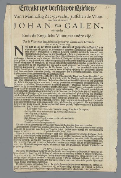
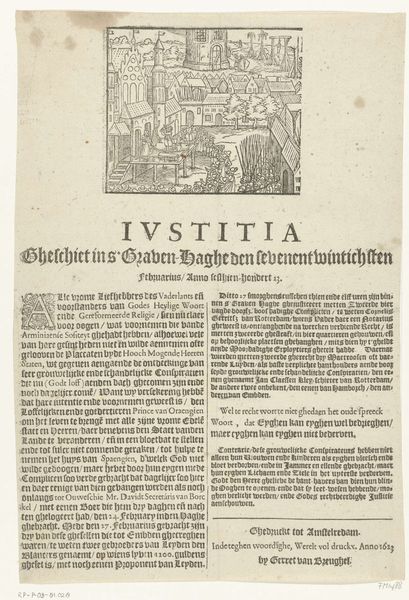
Editor: This print, titled "Pamphlet on the Cruelty of the English Against the Dutch," dates back to 1652 and is the work of Monogrammist PJVB. It looks like an early example of political propaganda! The calligraphy style seems so precise. What do you see when you look at this piece? Curator: It pulls you in, doesn't it? The density of the text, the sharp contrast of the engraving. For me, this isn't just a historical document; it’s a raw scream across centuries. Can you imagine holding this, newly printed, smelling of ink, fueled by the rage of the time? It was a powder keg in textual form. Look closer. Notice the graphic quality contrasting images. Editor: So, beyond just the text and anger, you see artistry? I guess I’m so caught up in the words, I overlooked the craft! Curator: Absolutely! It’s a brutal dance between information and emotion, a carefully orchestrated piece meant to incite. But do you think this level of craftsmanship could undermine its urgency, maybe appear "too polished?" What do you think? Editor: I think you’re right, maybe its detail elevates it… But also it makes me think this wasn’t some fringe idea. It seems almost officially sanctioned due to the artistic effort! I hadn't considered that. Curator: Exactly. Now consider the artist: they chose to put just a monogram, their creation both hiding, and highlighting their name, this pamphlet became personal. Art makes no sense until it means everything. Editor: That’s true, the care and craft create urgency. I now understand that this pamphlet as more than words - It's fury and defiance put in expert artistic expression. Thanks for offering that new lens.
Comments
No comments
Be the first to comment and join the conversation on the ultimate creative platform.
More like this