Copyright: Rijks Museum: Open Domain
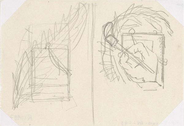
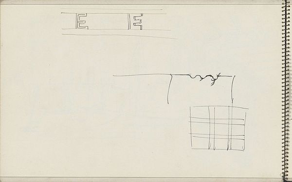
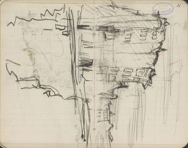
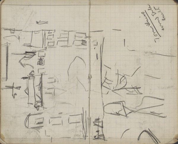
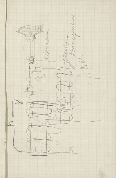
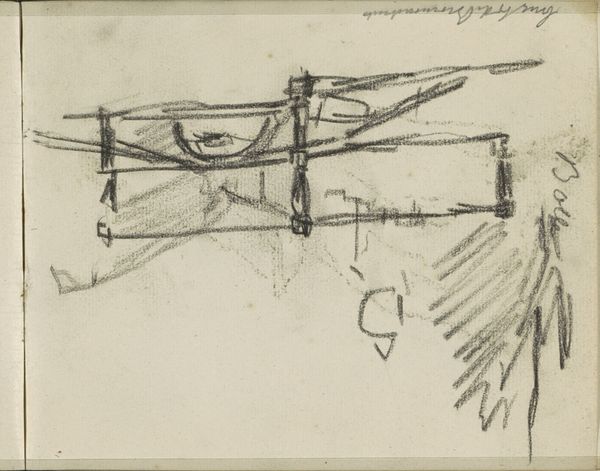
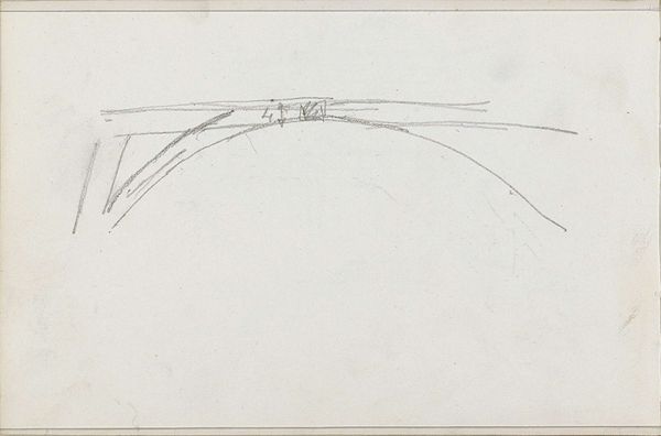
This page of Typografische ontwerpen was made by Carel Adolph Lion Cachet in 1934, using a pencil on paper. It's a jumble of ideas, a real peek into the artist’s mind at work. The whole thing feels very immediate, as if Cachet was thinking out loud with his pencil. There are circles and rectangles, words stacked on top of each other, and Roman numerals. It's not just about the final design; it's about the messy, beautiful process of getting there. I love how raw and unfiltered it feels. You can almost see him trying different things out, crossing lines, and adjusting shapes. Look at the vertical stack of letters in the middle, how some are shaded and others not. It’s as if the negative space is as important as the letters themselves. This reminds me of the work of the concrete poets or even some of the early Dadaists. They were all playing with language and form, pushing the boundaries of what art could be. It's a reminder that art is always a conversation, building on what came before and pushing us to see the world in new ways.
Comments
No comments
Be the first to comment and join the conversation on the ultimate creative platform.
More like this