Dimensions: overall: 32.4 x 47.4 cm (12 3/4 x 18 11/16 in.) framed: 41.8 x 57 x 6.8 cm (16 7/16 x 22 7/16 x 2 11/16 in.)
Copyright: National Gallery of Art: CC0 1.0
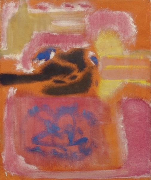
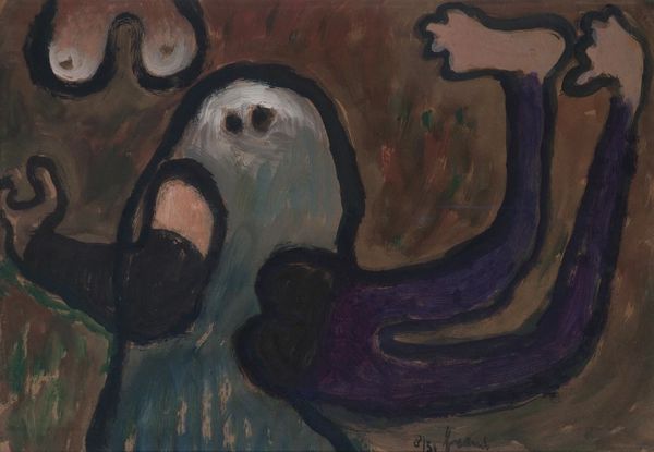
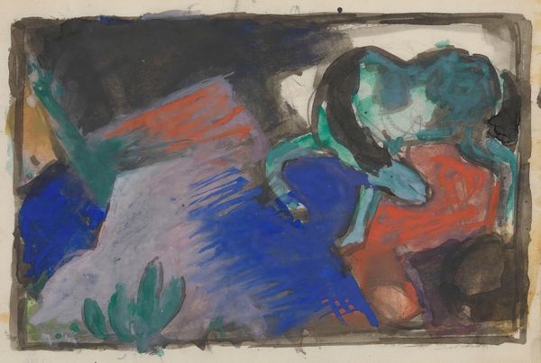
Editor: This oil painting is called "Untitled" and it's by Mark Rothko, created in 1942. The fantasy landscape depicted feels quite ominous to me. There's this imposing yellow form hovering over what look like shadow figures. What do you see in this piece? Curator: The strength of Rothko's early work resides precisely in its capacity to explore the latent semiotic potential within simple forms and colors. We can approach this "Untitled" through its formal components. The horizontal bands of color and ambiguous forms contribute to a surface tension—a visual push and pull that, while unsettling to some, animates the canvas. Do you notice the arrangement of black figures against the lighter ground, and how this creates visual dynamics? Editor: I do, yes. There’s definitely a push and pull happening, especially between those jagged black lines at the top and the soft, cloud-like quality of that main yellow shape. Is that tension deliberately ambiguous? Curator: It is crucial to consider that Rothko did not provide explicit symbolic content or narration, so it becomes important for us as observers to engage with these ambiguities. What do these colour planes evoke for you? And how does the orientation—primarily horizontal—impact your engagement? Editor: The colours, that sort of pale yellow on a lavender background, suggest perhaps a dream-like world. And I suppose that the horizontality makes it feel somehow grounded, but then these darker shapes throw me off and give it the feeling of an unreal experience. Curator: Indeed, this is an early example of Rothko's experimentation with layering colors and exploring abstract form before his more well known and expansive canvases of stacked, soft-edged rectangles. Understanding how this work prefigures his later, more monumental abstractions provides invaluable insight into Rothko’s formal artistic development. Editor: That's a great perspective, actually. Now when looking at it I can appreciate that it's really about these blocks of colours rather than what it's 'representing'. Curator: Exactly, by emphasizing these pictorial dynamics, the canvas invites one to dwell within and ruminate about it’s very substance as well as aesthetic properties.
Comments
No comments
Be the first to comment and join the conversation on the ultimate creative platform.
More like this