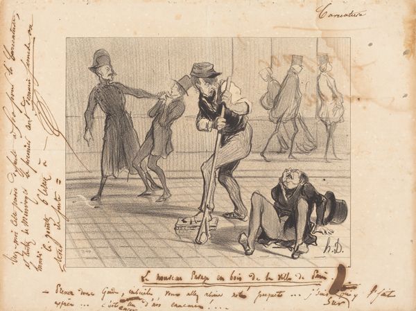
drawing, watercolor, ink
#
portrait
#
drawing
#
imaginative character sketch
#
quirky sketch
#
sketch book
#
personal sketchbook
#
watercolor
#
ink
#
idea generation sketch
#
sketchwork
#
romanticism
#
sketchbook drawing
#
genre-painting
#
storyboard and sketchbook work
#
fashion sketch
#
sketchbook art
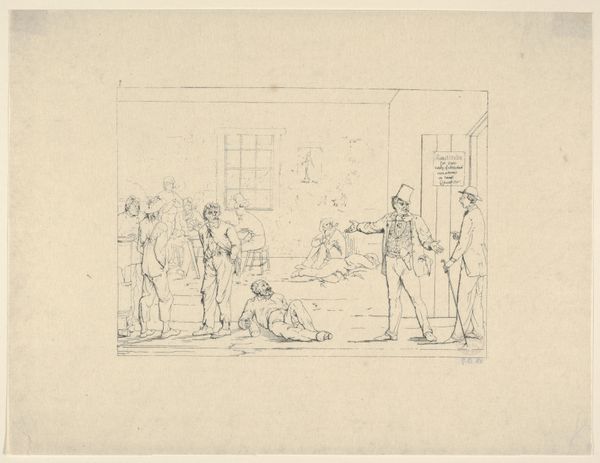
Dimensions: height 130 mm, width 179 mm
Copyright: Rijks Museum: Open Domain
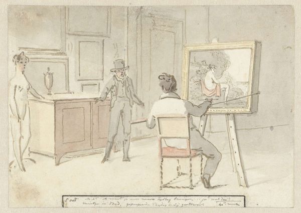
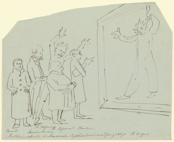
Editor: Here we have "Der heer hagbolt bij ons int college (dagboek, 18 augustus)" by Christiaan Andriessen, created between 1805 and 1808. It's a drawing in ink and watercolor, and the initial feel is rather sketch-like, giving a sense of immediacy. What jumps out to you in terms of its formal qualities? Curator: The piece presents an intriguing interplay of line and wash. Observe how the artist uses rapid, almost frantic lines to define the figures, creating a sense of movement. The limited color palette, primarily muted grays, accentuates the underlying structure of the composition. Note how the artist delineates form versus value, separating tone from geometry. How does the application of watercolor, with its inherent transparency, affect your understanding of spatial relationships within the piece? Editor: It makes the figures blend with the background a bit, which creates some ambiguity about where they are positioned in the space. Almost as if the space is undefined, while the subjects are clear. Curator: Precisely. Consider, then, how this contributes to the overall formal arrangement. The light appears diffused, softening the edges and further collapsing the depth of field. Are the lines and washes in harmonious tension or disharmonious discord? Editor: I would say a harmonious tension; the sketchy quality gives energy but is reined in by the muted colors. It feels balanced. What can you tell from the line qualities themselves, or perhaps from how the forms have been simplified? Curator: Look at the confident, almost calligraphic, strokes that delineate the figures' contours. They convey a sense of direct observation, as if Andriessen were capturing a fleeting moment. However, the simplification of form verges on abstraction. This suggests a focus on essential characteristics rather than precise detail. Observe the angularity of the lines, they introduce dynamism and perhaps a hint of underlying tension, despite the apparent balance in value. What principles of Gestalt psychology can be inferred here, given the figure/ground contrast, proximity, similarity, closure, and symmetry present within Andriessen’s arrangement of lines and light? Editor: Interesting. The artist uses very basic forms and yet you can feel movement and energy in the scene. I hadn’t noticed the tension but can see that in the angling of the strokes and forms, making you focus on essential, abstracted characteristics of forms. Curator: A close examination of the formal elements provides a framework for deeper art appreciation. Editor: Definitely, I learned to look at this piece differently, considering how it balances lines and wash. Thanks for the new perspective.
Comments
No comments
Be the first to comment and join the conversation on the ultimate creative platform.
More like this