painting, acrylic-paint
#
abstract-expressionism
#
abstract expressionism
#
abstract painting
#
painting
#
pop art
#
acrylic-paint
#
form
#
acrylic on canvas
#
geometric
#
abstraction
#
line
Copyright: Alfred Manessier,Fair Use
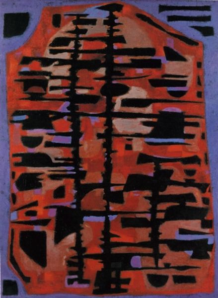
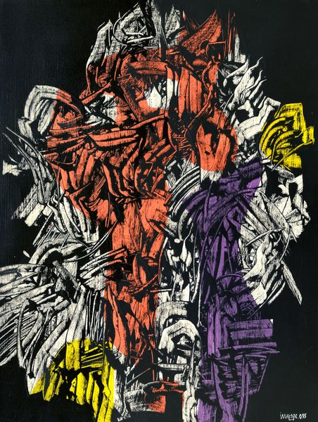
Alfred Manessier made 'La Mise au tombeau' with what looks like screen printing, with strong blacks and vibrant colour contrasts. There’s a real intensity in the way he builds up these colours. It’s like watching the colours fight it out, each one vying for attention. I love the way the solid black hovers over the bright ground, it's a bold statement and a heavy shape. The blue marks seem to be holding it down, the arrows of sadness. Around it, the acid yellow and hot pink feels so emotionally charged. There’s a real sense of feeling in that combination. Manessier reminds me a bit of Rouault with his strong lines and spiritual themes, but he takes it somewhere else, into a kind of abstract grief. It’s a reminder that art can be both beautiful and deeply moving, without giving you all the answers.
Comments
No comments
Be the first to comment and join the conversation on the ultimate creative platform.
More like this