graphic-art, print, engraving
#
graphic-art
#
pen drawing
# print
#
form
#
11_renaissance
#
line
#
decorative-art
#
engraving
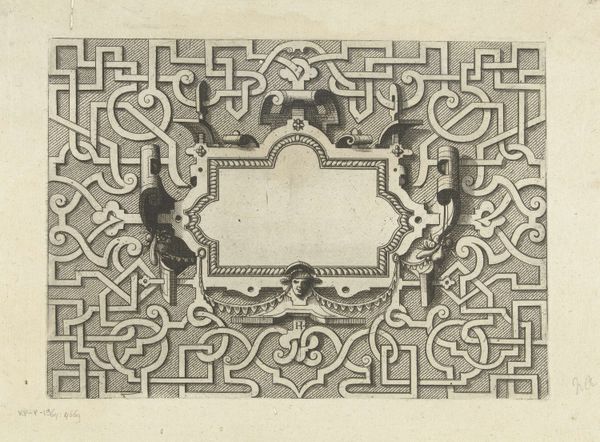
Dimensions: height 155 mm, width 209 mm
Copyright: Rijks Museum: Open Domain
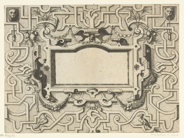
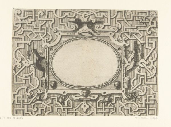
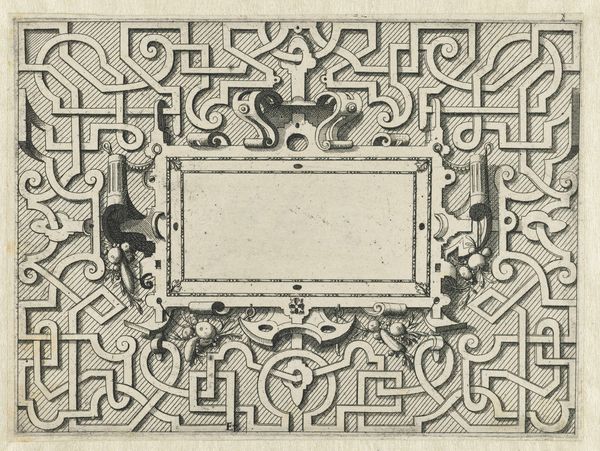
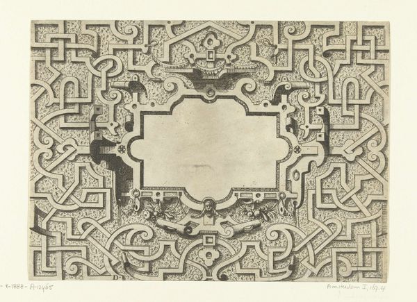
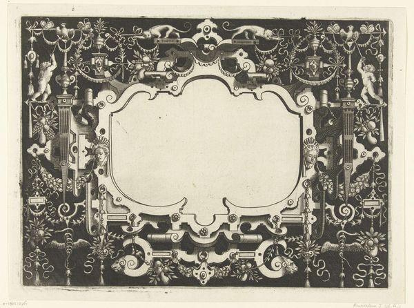
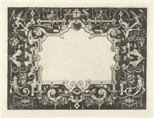
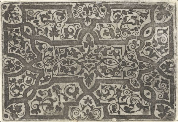
Curator: Here we have "Cartouche Surrounded by Moresques," a stunning engraving likely intended as a template for other artworks, dating back to the mid-16th century. Editor: Woah, it's a trip! Like stepping into a visual puzzle box. So intricate. All those tiny faces staring out from this maze-like pattern – they give me a slight feeling of unease. Is it supposed to be playful or something darker? Curator: It’s both, I suspect! The overall design definitely echoes that popular Renaissance style called moresque, or arabesque. See how the abstract geometric shapes intertwine with organic motifs like fruits and those... admittedly odd... little masks? It’s a delicate balance between order and chaos, and there's a touch of the grotesque thrown in for good measure. Editor: Grotesque, totally! And that contrast... is that intentional? It’s like they were saying, “Let's put something really pretty next to something a bit scary.” What's with the blank cartouche, though? Looks like a space for a name or… something. Curator: Exactly! That emptiness is brimming with possibility! It was designed to hold heraldry, a title, a verse, or any personal emblem the buyer might want to include. Think of it as personalized ornamentation. Moresques are closely tied to ideas of rebirth, harmony, and maybe a little mischievous energy with all those faces looking at us. Editor: Rebirth makes sense, like spring coming from frozen ground! It really is stunning craftsmanship, isn’t it? Imagining someone meticulously engraving all of this, centuries ago… I find that mind-boggling! What do you make of the miniature architecture too; like truncated columns placed sporadically? Curator: Good eye! They were quite keen on evoking classical themes, reinterpreted with that contemporary flair. Each piece seems deliberate, almost coded in its design, a mix of paganism and Christianity is often reflected here. Editor: It really is dense! All this layering... symbols within symbols... it feels so potent, almost overwhelming! It makes me wonder what our visual symbols will tell people 500 years from now? Curator: Ah, now you're touching upon cultural memory. It’s artworks like these which keep the memory alive! So what began as a potential label has since gained an aura, don't you think?
Comments
No comments
Be the first to comment and join the conversation on the ultimate creative platform.
More like this