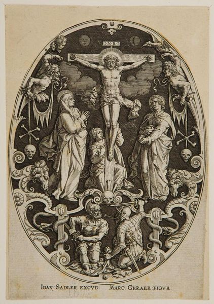
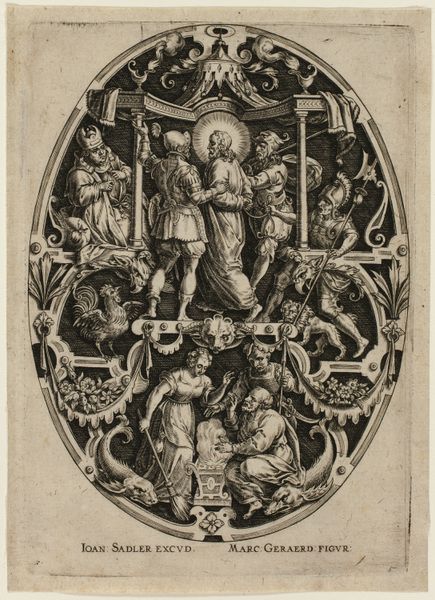
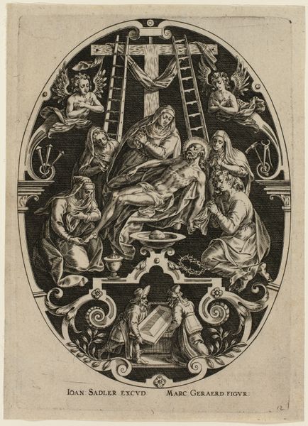
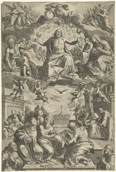
Gekruisigde Christus met Maria, Maria Magdalena en Johannes 1560 - 1600
johannsadeleri
Rijksmuseum
print, intaglio, engraving
allegory
pen drawing
pen illustration
intaglio
old engraving style
mannerism
figuration
11_renaissance
pen-ink sketch
pen work
sketchbook drawing
history-painting
engraving
Dimensions: height 161 mm, width 114 mm
Copyright: Rijks Museum: Open Domain
Curator: Johann Sadeler I created this engraving titled “Gekruisigde Christus met Maria, Maria Magdalena en Johannes" sometime between 1560 and 1600. Editor: Whoa, it's intense. Very dark. The suffering just emanates, even with all the detail competing for your attention. It's a bit like a heavy metal album cover... from the Renaissance! Curator: Indeed. Formally, the composition utilizes an oval format to frame the central scene of the crucifixion, which allows for a dense layering of symbolic and allegorical elements arranged both above and below. The interplay of light and shadow, achieved through meticulous engraving, amplifies the drama. Editor: See, that's exactly what I mean. The eye bounces everywhere. You've got the skull motifs, serpentine figures writhing, these bizarre demonic onlookers up top… It's a lot. What's the point of jamming so much visual information into one image? Curator: That is very much in line with Mannerist principles; The intention isn't always clarity but demonstrating the engraver’s technical virtuosity while also presenting layers of theological interpretation. The figures of Mary, Mary Magdalene, and John anchor the central lamentation while allegorical figures below engage in a struggle representing the battle between good and evil, death and salvation. Editor: So it’s less about the raw emotional punch of the crucifixion and more about fitting everything in. Though, you know, the more I look, the more those subtle tonal gradations suck me in. It is expertly done, can't deny that. There is even some serious atmospheric perspective at work, if you look closely at those clouds. Curator: Notice how the flanking figures outside the central scene lead the eye, directing you to those deeper thematic readings, even if that initial reaction might be a bit scattered, a bit "metal album cover" as you so eloquently put it. Editor: Haha, yeah well, first impressions are powerful, aren't they? Even if they’re a tad… unsophisticated. I think getting past the initial sensory overload lets you appreciate the sheer artistry in Sadeler's technique. Still pretty dark, though. Curator: Indeed. A successful engraving that exemplifies its historical period's artistic aims while prompting ongoing interpretative possibilities even now. Editor: Okay, I'll buy that. Gives you a lot to think about – death, salvation, and whether skulls are ever *not* goth.
Comments
No comments
Be the first to comment and join the conversation on the ultimate creative platform.