Copyright: Modern Artists: Artvee
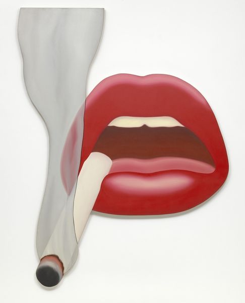
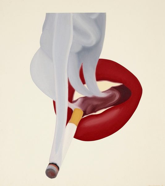
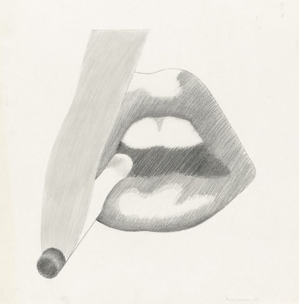
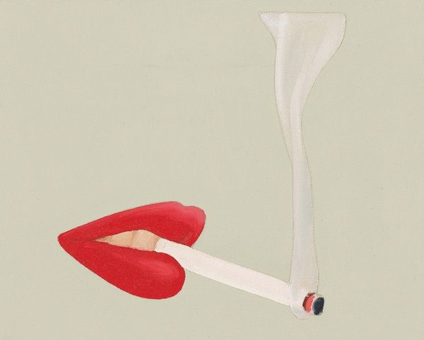
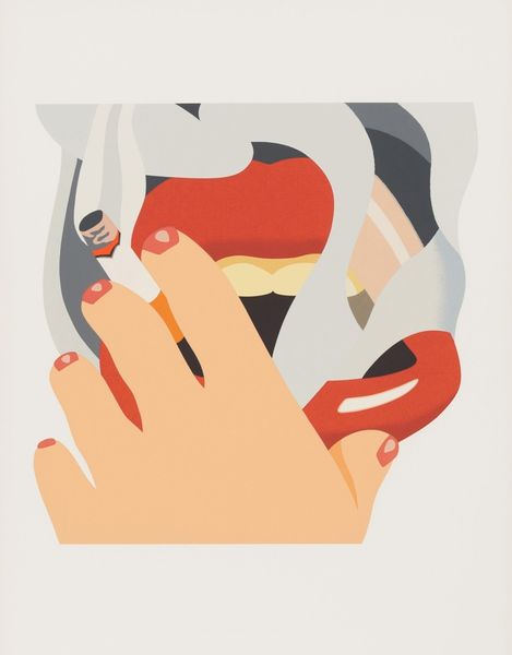
Tom Wesselmann made this banner of a smoker at an unknown date using, it seems, cut out shapes. Look at the way the flatness of the forms lets the colours do all the work. The colours here are so bright, almost cartoonish, especially that fire engine red of the lips. And the smoke is not just grey, but has these wonderful beige tones that make it feel almost substantial, like it’s another object rather than just dissipating into the air. It’s funny how the bright colours bring to mind the pop art scene of the time, a bit like Warhol’s screen prints. But where Warhol was all about repetition, Wesselmann seems more interested in paring things back to their simplest forms. I wonder if Wesselmann was thinking about Matisse’s cut-outs when he made this. Both artists share a love of bold colour and simple shapes. But while Matisse’s cut-outs are often about movement and rhythm, Wesselmann’s feels more static, more like an advertisement. It’s all about taking something familiar and making you see it in a new way. It’s not about fixed meanings but open interpretation.
Comments
No comments
Be the first to comment and join the conversation on the ultimate creative platform.
More like this