drawing, paper, pencil
#
drawing
#
light pencil work
#
paper
#
personal sketchbook
#
geometric
#
pencil
#
line
#
sketchbook drawing
#
sketchbook art
Copyright: Rijks Museum: Open Domain
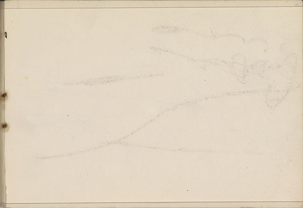
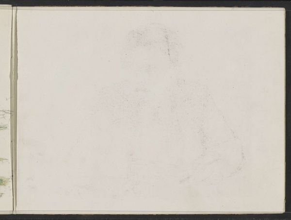
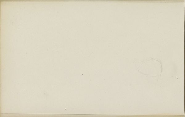
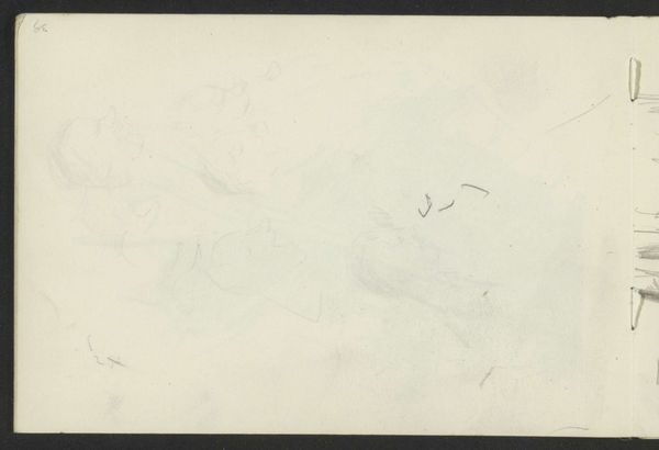
Editor: We are looking at "Abklatsch van de krijttekening op pagina 24 verso," a pencil drawing on paper by Carel Adolph Lion Cachet, from around 1905. It’s very subtle, almost like a ghost of an image. I see faint lines, hinting at geometric shapes, barely there on the page. What stands out to you in terms of its composition? Curator: Precisely. The extreme subtlety is its defining characteristic. Note the deliberate use of line – almost ephemeral. The composition isn’t about the geometric shapes themselves, but the *relationships* between these barely visible forms. The negative space is equally important; it defines what little positive space exists. Editor: So you're saying the emptiness is just as crucial as the lines? Curator: Absolutely. The sparse lines wouldn't have as much visual power without the void surrounding them. It begs the question, what exactly did the artist seek to explore with this method? What meaning can be derived from it, beyond geometric art? Editor: It's interesting how little is there, but how much there is to consider in it as a result! Curator: A seemingly simple sketch encourages a closer look at what drawing and form can mean. I think Cachet makes the viewer work a bit harder to grasp that idea, through pure formalism. Editor: Thank you! I will never look at a faint line in the same way! Curator: And I, through our talk, better understand that such sparseness encourages viewers to supply their own interpretations more freely. A good dialogue, indeed.
Comments
No comments
Be the first to comment and join the conversation on the ultimate creative platform.
More like this